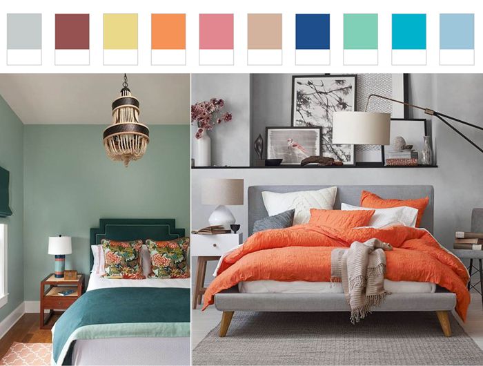
9 key shades in 2015 according to Pantone.
In addition to the Marsala shade, which became the main color of 2015, Pantone Corporation named 9 more colors that have become key in fashion design and interior design. Basically, this year pastel cool shades were relevant – a symbol of tranquility and deliberate departure from the daily hustle and bustle.
«Most of us experience real information bombardment every day. We are constantly online, because we are afraid to miss something important. The time has come to push technology into the background and give way to something natural, calm, and pacifying. Therefore, we chose soft and delicate shades as the 9 main colors of 2015», – says the CEO of Pantone.
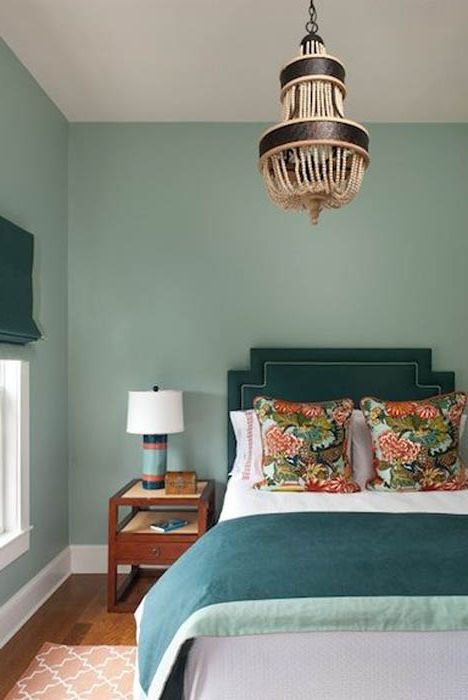
Aquamarine color in the interior.
The Aquamarine palette starts with a serene and radiant color. Delicate and cool, it can be used as an interior background. Calm Aquamarine does not tire and helps to relax, therefore it is best suited for a bathroom, bedroom or nursery.
Underwater Blue in the interior.
Bright and cheerful color Scuba Blue (Underwater Blue), well suited for the role of accents in the interior. Although it belongs to the category of cold shades, its piercing color evokes associations with summer, clear skies and blue sea. It should be introduced into the interior with the help of small accessories and textiles..
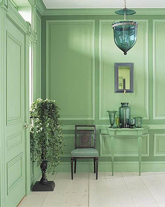
Fresh green for wall decoration.
Lucite Green – Fresh and clear, close to mint, ideal for vacation spots. In large quantities, it runs the risk of quickly getting bored, therefore it needs to be diluted with more saturated shades..
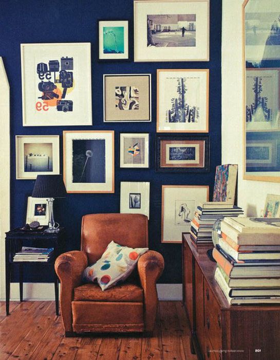
Classic Blue in home design.
Classic Blue (Classic Blue) expresses stability and reliability. Designers advise combining it with Green Lucite to create a balanced look..
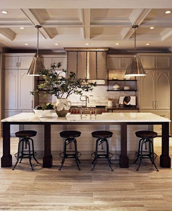
Roasted Almond Kitchen.
Toasted Almond brings balance to this summer vibrant line, balancing it with its neutral hue. The calm beige shade symbolizes warmth and comfort, and also reminds of a hot summer, being similar to the color of tanned skin. It works well with the following colors that are in a warmer tonal range..
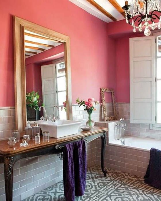
Color Strawberry Ice Cream for Wall Decoration.
Strawberry Ice (Strawberry Ice Cream) is a light, nutritious, fairly dense shade, close to coral. Designers have long played tones that are very close to it in interiors. Ideal companions – white, gold, muted green in small quantities.
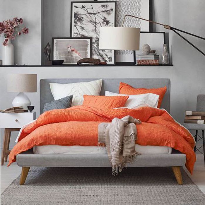
Cheerful Tangerine in the bedroom interior.
Tangerine is energizing without irritating the eyes. It is a cheerful color that makes you want to smile. Best paired with Roasted Almonds and Strawberry Ice Cream.
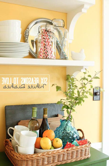
Appetizing shade of Custard in the interior of the kitchen.
Sunny and light Custard (Custard) – a fairly neutral natural shade that goes well with any tones of brown.
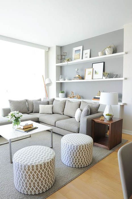
Color Gray Glacier in the interior of the apartment.
Glacier Gray, Glacier Gray is a color beyond time and convention. Elegant and discreet, it will be a worthy pair with any of the listed colors.

