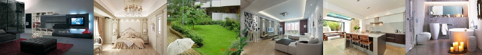
White, gray, beige are colors that have become relevant in interior design. But what if they seem boring and inexpressive? We share proven methods that will help create win-win color combinations in the interior.
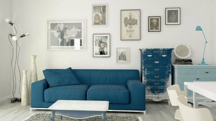
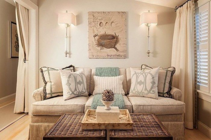
1. Universal semi-neutral colors
Semi-neutral shades are muted blues and greens. They go well with almost any other color and with each other..
2. Two adjacent tones
Two adjacent tones of the same color – a simple yet effective color combination. For the interior not to be monotonous, do not forget about contrasting accents.
3. Game without rules
Another possible option when choosing a color scheme is not to follow any rules at all. But in this case, a neutral background should prevail in the interior, on which color splashes will look especially expressive..
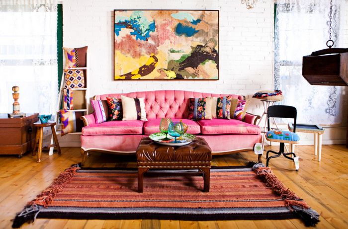
4. Orientation to wallpaper
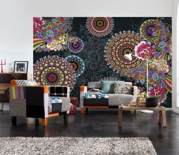
Choose a wallpaper with a complex multicolored pattern. This is the palette to focus on. Each of the colors present in the interior should also be on the wallpaper..
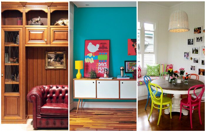
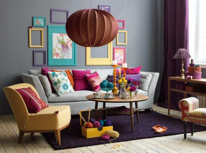
5. Several small geometric ornaments
Feel free to combine several items with a small geometric pattern in the interior. As a palette, you can choose an abstract painting where many colors are combined. But this rule can be neglected, relying only on your own imagination..
6. Vivifying white
A combination of neutral or semi-neutral colors can look dull. A universal way to liven up this combination is to add white to it, for example, a painting in a light frame..
7. Wood is a universal neutralizer
How to combine several bright colors in the interior? Excessive clutter in the design will be smoothed out by white elements, for example, window and door trim. By the way, white has the same effect..
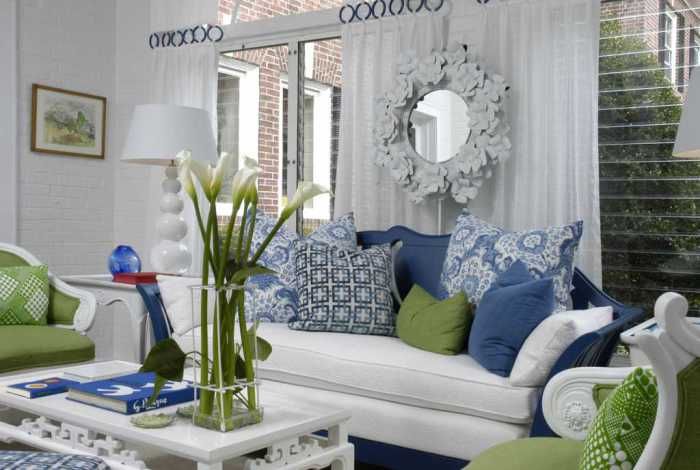
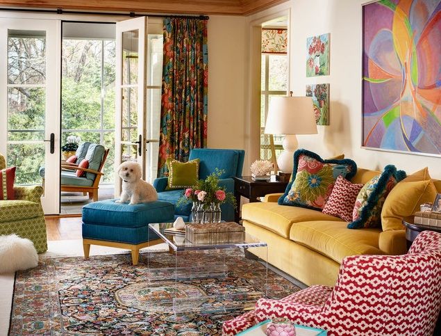
8. Pillows as color accents
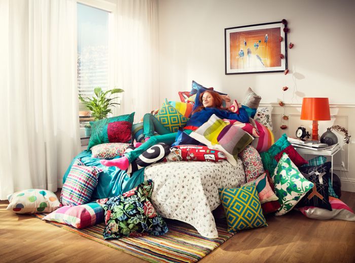
A lot of bright pillows are a democratic and affordable way to liven up any interior. When such decor gets bored, it is easy to remove or replace it with a more discreet one..
9. Small bright details
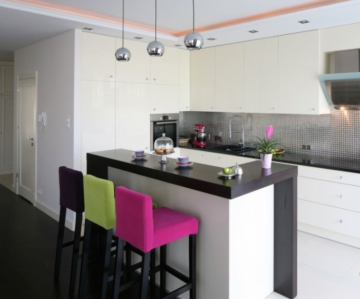
Pillows as accent colors are not appropriate in every room. They can be replaced by bright lamps or multi-colored chairs..
10. Softening complex textures
While focusing on color combinations, don’t forget about the variety of textures. For example, a stone or brick will perfectly fit into almost any interior, softening bright color combinations in it..
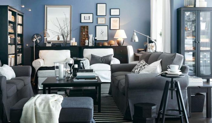
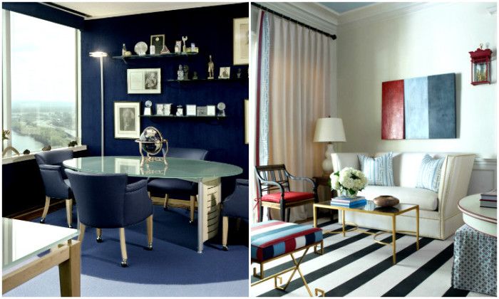
11. Balance of warm and cold shades
Do not combine warm dark colors with cold light colors. For example, burgundy with gray-blue or snow-white.
12. Pastel incompatible with black
If pastel shades of pink, brown, blue or peach are chosen as the main colors in the interior, then we recommend avoiding the presence of black interior details.
13. Smooth transitions from one color zone to another
How to combine colors in the interior of different rooms? It is not at all necessary that the colors in all rooms are the same. But we recommend that you ensure a smooth color transition between adjacent zones in the house..
Once the color scheme of the interior has been determined, it is time to take care of the decor. for example, make it yourself with their PVC pipes.