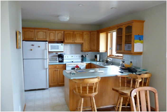
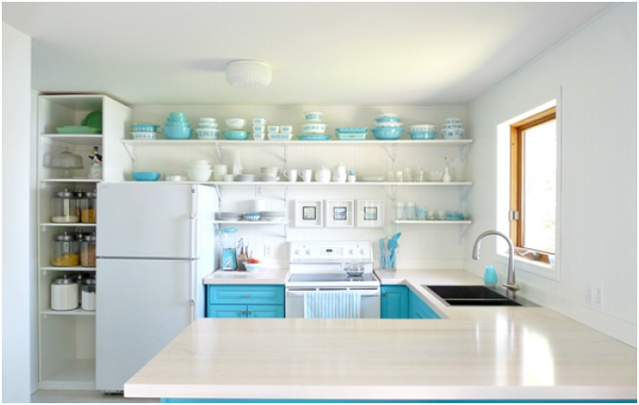
Kitchens before and after renovation.
How to improve the kitchen space and organize it correctly? To understand this, we decided to take a look at real-life examples. The design of these interiors was invented by the owners themselves, without the help of decorators. Some of the alterations were very budgetary and required special attention. We looked at each of them!
1. In traditional style
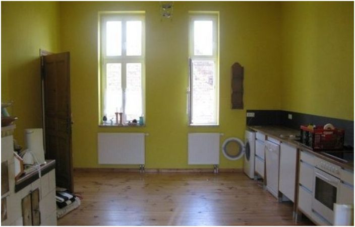
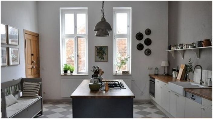
The room looked dark and uncomfortable.
Before the renovation, this kitchen had a lot of space, but the owners did not get any benefit from it. In addition, ocher walls seemed to compress the space. Since the area was not limited, the traditional style was chosen for the interior decoration. A large island was placed in the middle of the room, the walls and furniture were made in light shades, and a seating area was organized near the wall. So, the kitchen has become much more comfortable!
The walls were decorated in light colors
2. More air
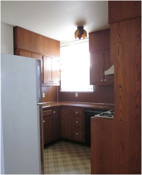
Oversized furniture cluttered the space
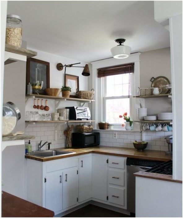
The tiny kitchen was originally designed incorrectly, and the bulky dark furniture made it even smaller. Therefore, all brown spots were replaced with white ones, the furniture was chosen more compact and functional. To visually expand the room and let in as much air as possible, open shelves were installed on the walls..
After the renovation, the kitchen became visually more spacious
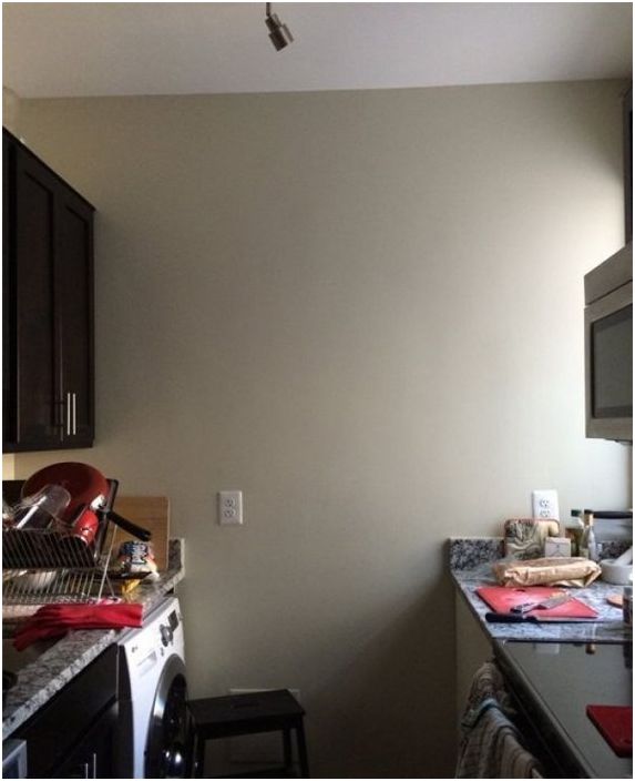
3. From white to black
Despite the light walls, this kitchen looked cramped.
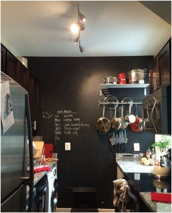
This is a worthy example of how to update a kitchen interior on a budget and at the same time give the room a perspective. If in the previous examples light shades saved the space, then in this kitchen they went the opposite way. The light wall was painted with chalkboard effect paint. The rich dark shade did not visually eat up the space, but seemed to move the wall a little. It turned out stylish and interesting.
Chalkboard paint transforms this kitchen
4. Alteration without alteration
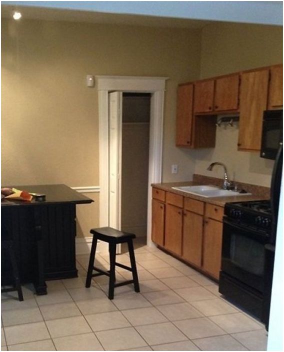
Kitchen before renovation
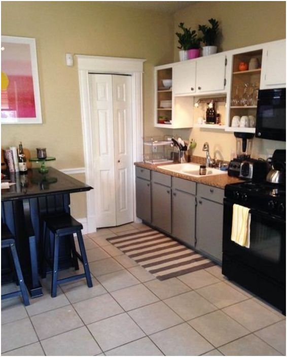
In this interior, as they say, they cost a little blood. The walls were not repainted, the floor was not altered, and the furniture was not even changed. It was possible to transform the interior with the help of simple improvised means. A small painting was hung on the wall in a refreshing color scheme. A rug with a dynamic pattern was laid on the floor, which visually expands the room. And the furniture was simply renewed by repainting its facades..
Budget kitchen makeover
5. Heavenly shades
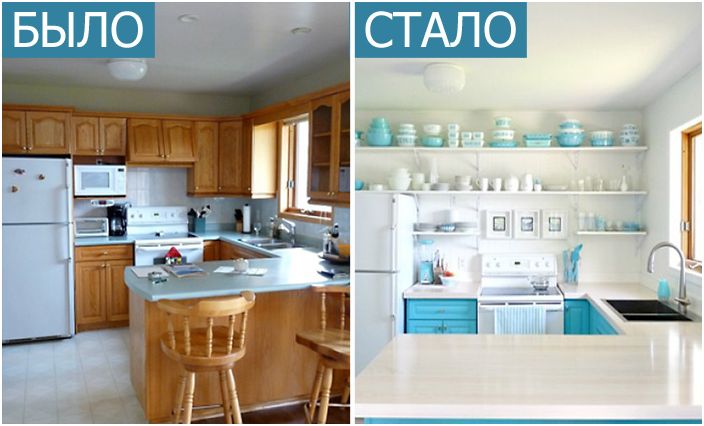
Before the renovation, the kitchen looked good
Nothing transforms a kitchen like smart colors and stylish storage systems. Before the rework, this kitchen looked pretty decent, but its owners wanted more dynamics, clean tones and visual space. Therefore, the kitchen was made in a snow-white shade and supplemented with splashes of blue color scheme. Instead of hanging cabinets, which visually weighed the space, long open shelves were installed on the walls. But, what is most interesting, they did not change all the furniture, leaving the lower cabinets, only repainting them. As you can see, a budget interior can be quite stylish..
Stylish kitchen transformation
By the way, before starting the alteration, it is better to find out how you can save money on kitchen renovations. For example, we found 5 practical ideas and 15 illustrative examples..

