Small kitchen: 5 cool examples that will turn the idea of small spaces
How to arrange a tiny kitchen, and how to fit this area into the interior of a studio apartment? It seems that it is very difficult, but if you know a few design tricks, you can turn a small kitchen into the coziest place in the apartment. We found five real-life examples that are direct evidence of this..
Translucent lens flare
Translucent lens flare
The kitchen space should never be dark. First of all, you need to fight with the feeling of crowding with the help of color. There are several options here:
• use beige shades, diluting them with coffee inserts;
• make the kitchen snow-white – this will significantly expand the space;
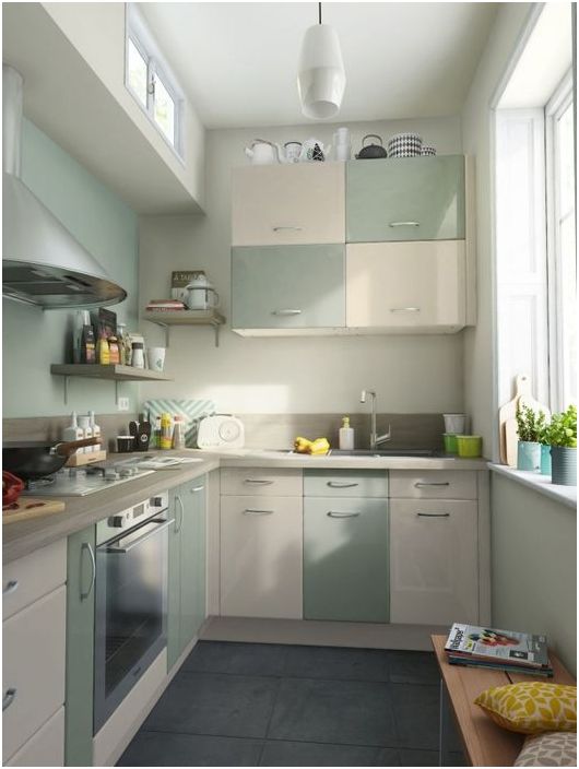
• give preference to soft translucent tones, preferably cold ones, since it is they that play to visually increase the space.
For the design of this kitchen, just the third option was chosen. Ivory and subtle turquoise were used in equal measure. Part of the fronts of the kitchen set were equipped with glossy doors, which made it possible to increase the light, and thereby get rid of the feelings of cramped and discomfort.
The beauty of natural wood
The beauty of natural wood
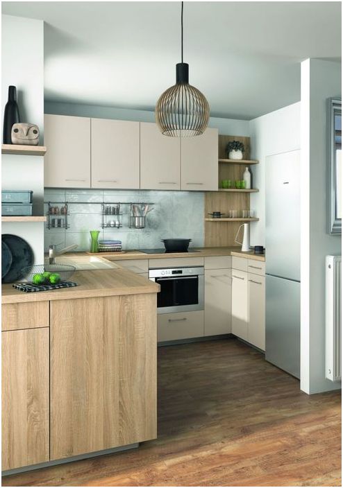
Natural wood always looks stylish, laconic and presentable. For this small kitchen, they chose worktops made of light natural wood, and the kitchen set was chosen in the same shade. In order to visually expand the space, the apron was decorated with blue ceramic tiles, which are harmoniously combined with natural wood. The result is a great contrast that refreshes the interior..
When there is very little space
When there is very little space
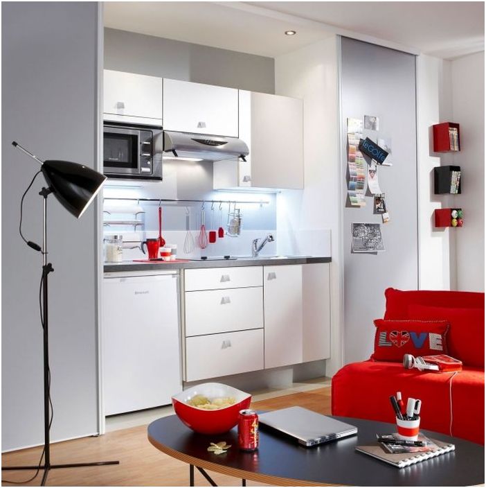
Some studio apartments are so cramped that the location of the kitchen can sometimes be a real problem. In this case, you need to think about compact options, for example, allocate only a small niche for the kitchen. In the lower part, determine the place for the dishwasher and the stove, in the upper part, arrange the kitchen cabinets with various utensils. In the area of the apron, install rails and hooks on which you can store spices, ladles, knives and other small things.
Scandinavian brevity
Scandinavian brevity
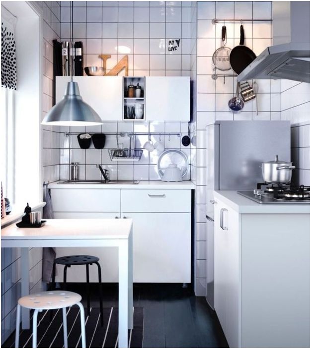
Simple shapes, clean lines, white color, large tiles on the walls – the famous Scandinavian style is traced in every detail of this kitchen. It is ideal for small spaces. It is believed that large square tiles visually make the space of a small kitchen even smaller, but in fact, it gives volume. If the choice fell on just such a tile, then you should immediately take the glossy option so that the light glare plays on the wall surfaces and visually exaggerates the area.
White top black bottom
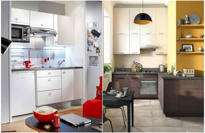
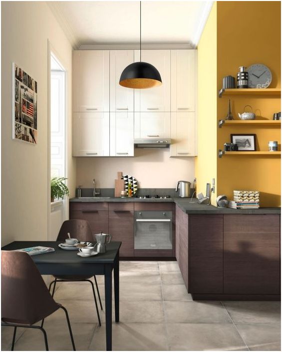
When the ceilings in the room are too low and you want to visually raise them, a very simple color scheme will come to the rescue, which is familiar to everyone since the days of school uniforms – white top, black bottom. For example, the upper cabinets can have white or cream fronts, while the lower ones are made of dark wood. It looks incredibly stylish and very attractive..
White top black bottom
We found 10 more simple ideas for a great organization of the space in the kitchen. They will be useful to any housewife!

