Striking remodel of a small bathroom
How to make a bathroom renovation and not miscalculate? What should be considered when remodeling a small room in order to visually make it beautiful, light and spacious? We have selected striking examples «before» and «after» repairs that will help to understand such difficult issues.
Stylish dynamics
Stylish dynamics
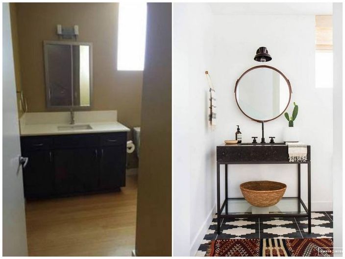
Before the renovation, this bathroom was devoid of style, its walls and floor were made in the same color, which did not look very favorable in a small space. The cabinet with the mirror also looked bulky. During the alteration, the mustard shade was changed to white, the floor was decorated with tiles with a dynamic pattern, the awkward interior items were replaced with a mirror and a curbstone that were light in design and shape. The interior has become more dynamic and easier to perceive.
Glamorous accents
Glamorous accents
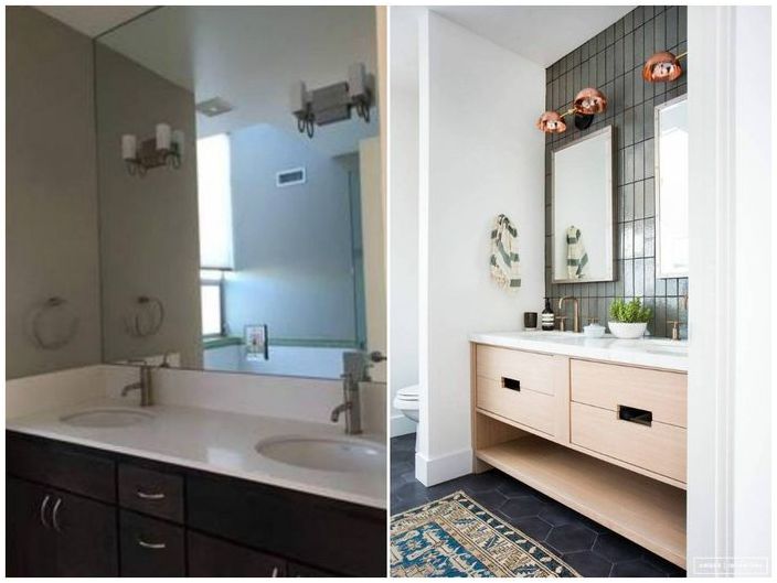
There was nothing wrong with the first design option for this bathroom, but it clearly lacked light, and the dark facades of the pedestals visually lowered the ceiling. The one-piece mirror was replaced by two stylish mirrors in a trendy rectangular shape, which visually makes the ceiling higher. The wall was faced with glossy tiles that reflect light and visually multiply the space. The interior could not do without glamorous accents, for example, copper lamps and brass faucets..
Notable update
Notable update
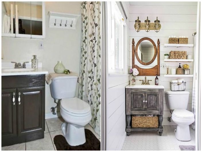
Sometimes it is worth freshening up the interior a little, without altering anything globally, and it will look much better than before. So it happened with this bathroom, where the finish was updated without changing its color. The plumbing was left the same, only pieces of furniture were replaced, moreover, observing the format of the rustic style. At the same time, it turned out to increase the number of storage systems, due to several open shelves and a cabinet with a lower compartment.
Not a superfluous detail
Not a superfluous detail
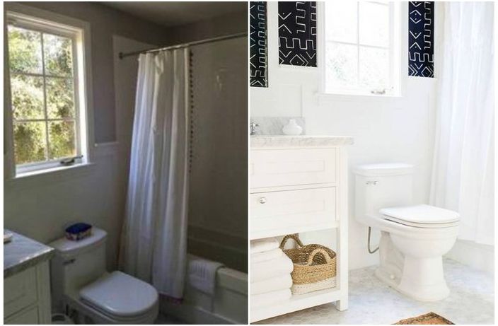
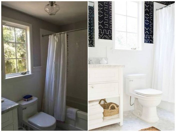
When a plain interior becomes boring, it needs to be diluted with a variety of interesting elements. For example, in this room, the white color of the walls was refreshed, and some of them were decorated with black paint and colorful ethnic patterns. This technique made the interior stylish and expressive, and also broke the gloomy stereotype of black. It turns out that it looks good in a small space too..
Laconic and elegant
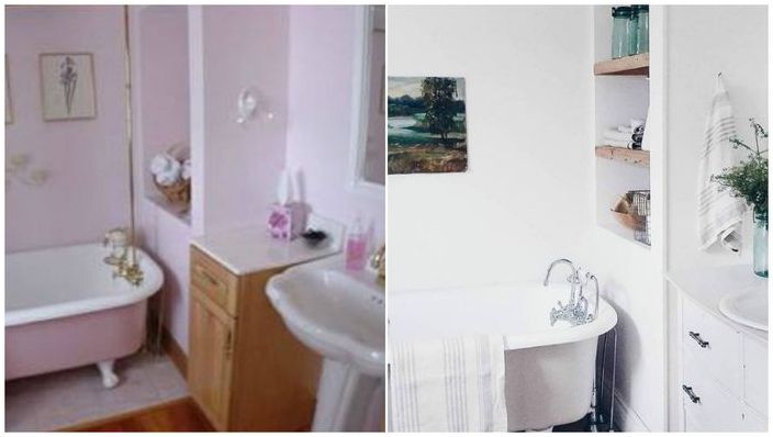
Before the redesign, the small bathtub was decorated in a glamorous pink color, but it quickly gets boring, and does not always have a positive effect on a person. Therefore, the right decision was to leave it in white, leaving an unobtrusive lilac shade, which creates a pleasant spring atmosphere in the interior. In addition, the niche was supplemented with open shelves, the wall was unloaded from the decor, and instead of a free-standing cabinet, a cabinet was made monolithic with a sink. This makes the bath look more refined and elegant..
Laconic and elegant
In the spring, you want to remodel not only the bathroom, but also the kitchen. We’ve collected 5 impressive examples of remodeling this room «before» and «after». These photos are worth a look!

