What color of the backsplash should be chosen in order to match the facades of furniture and other finishing elements? Should the kitchen walls be contrasting or rather muted? Choose kitchen interiors using the tips and photos of this article.
Choosing an apron in the kitchen: decor in different styles
Choosing an apron in the kitchen: decor in different styles
Many people ask themselves which work wall color is best for the kitchen? This is not an easy decision, because the color of the backsplash must match the facade of the furniture in order to achieve harmony in the design of the room..
Choosing an apron in the kitchen: decor in different styles
Monochrome kitchen interior
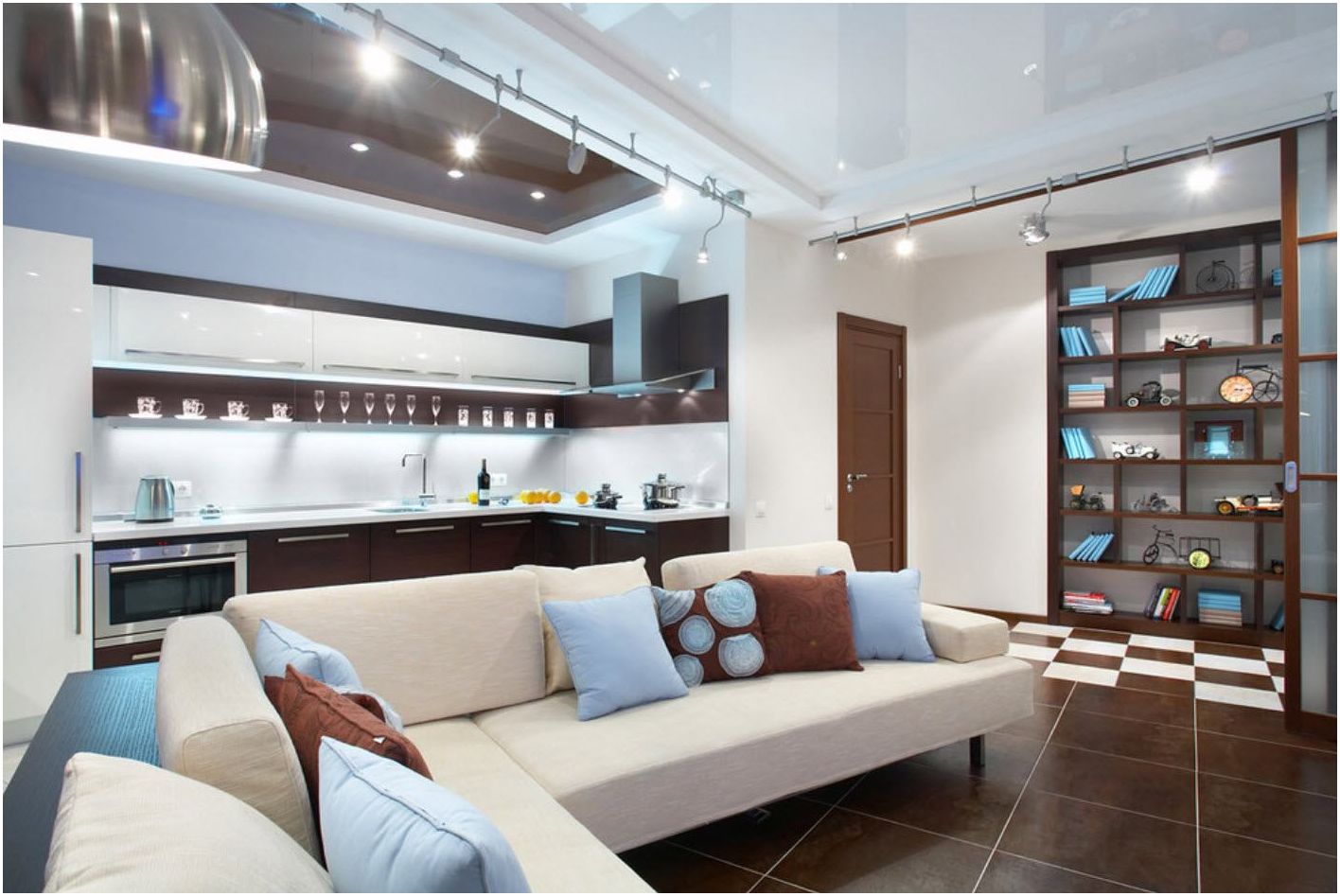
If you choose the classics, then it is advisable to prefer a monochrome design, in which the color of the apron will be in a single palette with the furniture facade. Consider photographs of a kitchen in which the colors of the walls and furniture were well chosen.
Choosing an apron in the kitchen: decor in different styles
Choosing an apron in the kitchen: decor in different styles
Distinct contrast
When choosing kitchen facades in darker colors, the walls in the kitchen should be painted in light colors, and vice versa. Choosing a backsplash in light will increase the color contrast, making the color even brighter and the cabinetry more intense..
Choosing an apron in the kitchen: decor in different styles
Choosing an apron in the kitchen: decor in different styles
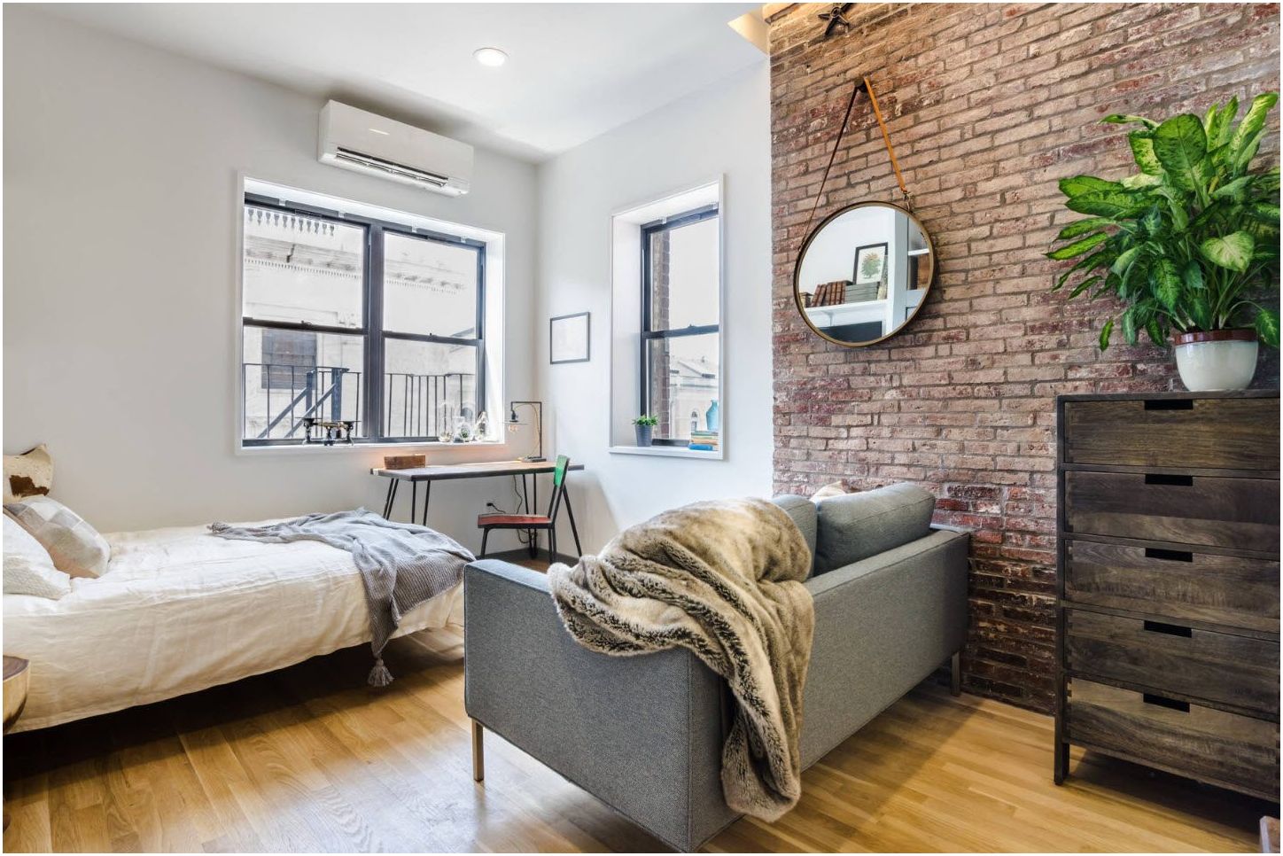
Advice! If you like modern kitchen furnishings, then you can decorate the kitchen apron with brick, steel sheet, rough finish thanks to structural plaster. However, for finishing the kitchen work surface, it is advisable to choose those materials that are easy to clean and wash, so raw building materials can be replaced with imitation using tiles, plastic, glass, etc. Grease and dust can be easily removed on such surfaces..
Choosing an apron in the kitchen: decor in different styles
Color combination of apron and kitchen fronts: choose colors for your appetite
A kitchen apron in colors such as shades of orange, peach or ripe pears create a positive mood in the composition. They warm the interior of the kitchen and are associated with summer and sun. Such colors of the working wall stimulate appetite, induce to a feast, therefore it is recommended to choose rich designs for people who want to make the interior more expressive. If you choose orange and red colors for the kitchen, then it is advisable to select the facades of the cabinets white or cream, against a similar background they will look more harmonious.
Choosing an apron in the kitchen: decor in different styles
Choosing an apron in the kitchen: decor in different styles
Do not be afraid to experiment with colors, liven up the interior beautifully and give it an original character. Check out an inspiring gallery of colorful cuisine. Green, yellow, red, orange. You can have each of these colors in your kitchen. Choose the one you like the most, and instead of the versatile white or calm beige, choose a bolder solution this time. Colorful kitchen furniture and an apron will look really interesting.
Choosing an apron in the kitchen: decor in different styles
The role of lighting in choosing the color of the walls for the kitchen
Surrounded by white and bright light, the cappuccino-colored kitchen walls take on a beige tint. In turn, in poor light, they look like chocolate. It should also be remembered that surfaces can be matte and glossy. Kitchen fronts and work surfaces should be designed so that they look equally good in both natural and artificial light..
Choosing an apron in the kitchen: decor in different styles
Choosing an apron in the kitchen: decor in different styles
Pastel colors in the kitchen
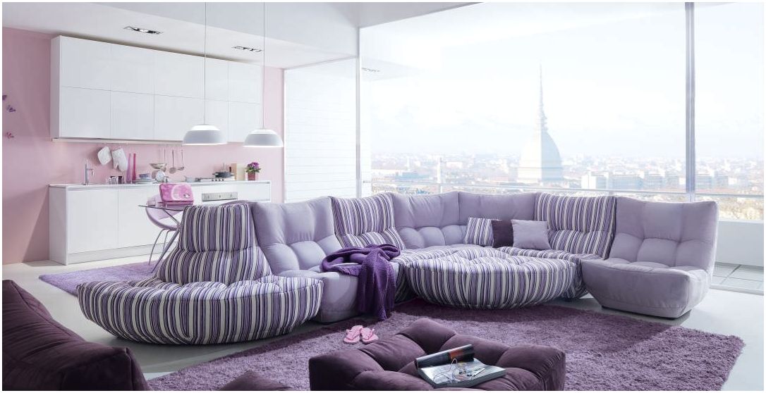
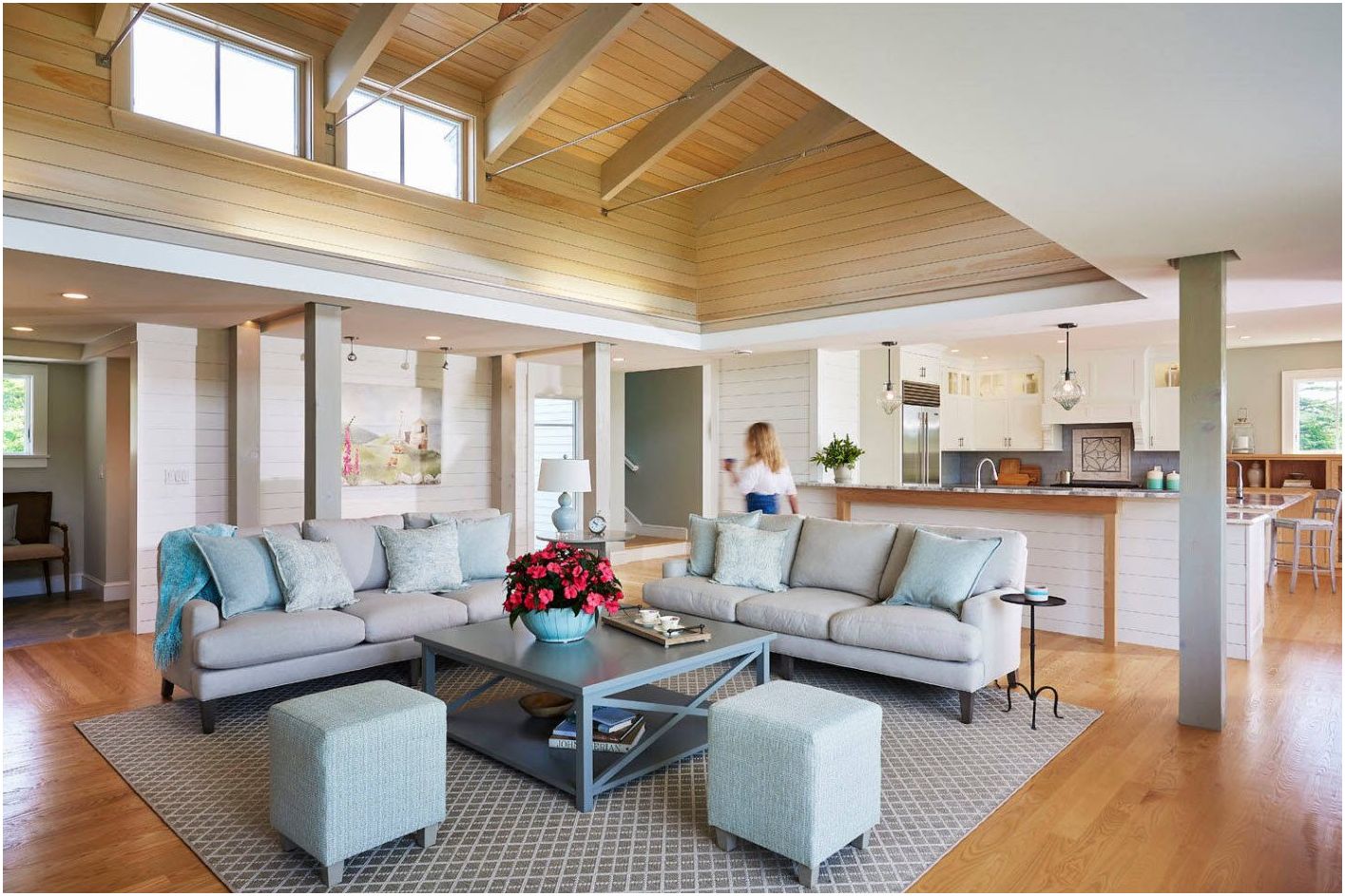
The pastel tones of the backsplash will make the interior look more friendly and fresh. To prevent the pastel color of the working panel from looking too faded, then combine it with white or wooden cabinets, floor, ceiling or blinds.
Choosing an apron in the kitchen: decor in different styles
The blue color of the walls in the kitchen soothes, repels insects, reduces appetite, so it is good for losing weight.
Choosing an apron in the kitchen: decor in different styles
The pink color of the walls, in turn, refreshes and makes the interior more delicate..
Choosing an apron in the kitchen: decor in different styles
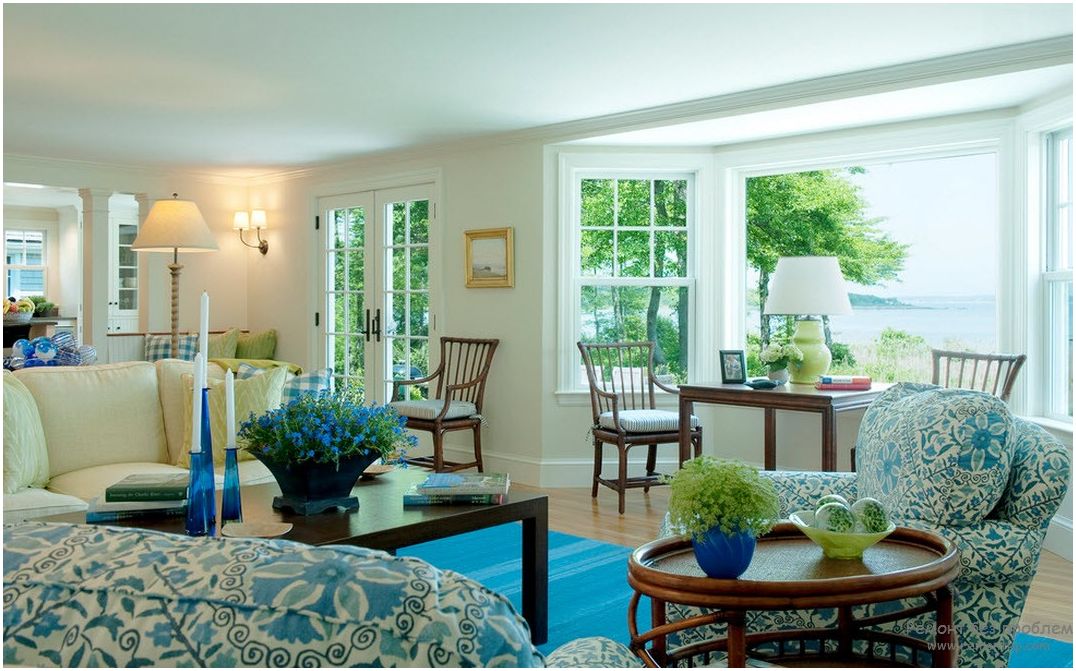
Sheet Metal Kitchen Apron
In industrial-style kitchens, designers often advise using sheet metal in the form of stainless steel, aluminum or copper to decorate the apron. This finish will blend well with wooden facades, giving the kitchen an original look..
Choosing an apron in the kitchen: decor in different styles
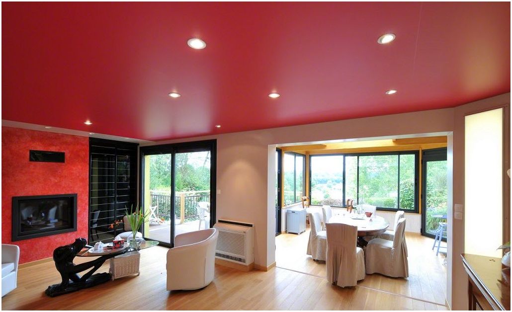
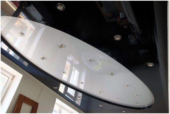
Stone in the cladding of the working wall in the kitchen
Which stone is right for a work wall in a kitchen? Usually granite, quartz or marble is used. Everything must be protected by impregnation, after which the surface becomes resistant to staining and high temperatures. Natural stone looks elegant and matches almost any style and color of the kitchen. Thus, you can choose both light and dark facades for it, depending on the color of the stone. It will look very nice anyway..
Choosing an apron in the kitchen: decor in different styles
Choosing an apron in the kitchen: decor in different styles
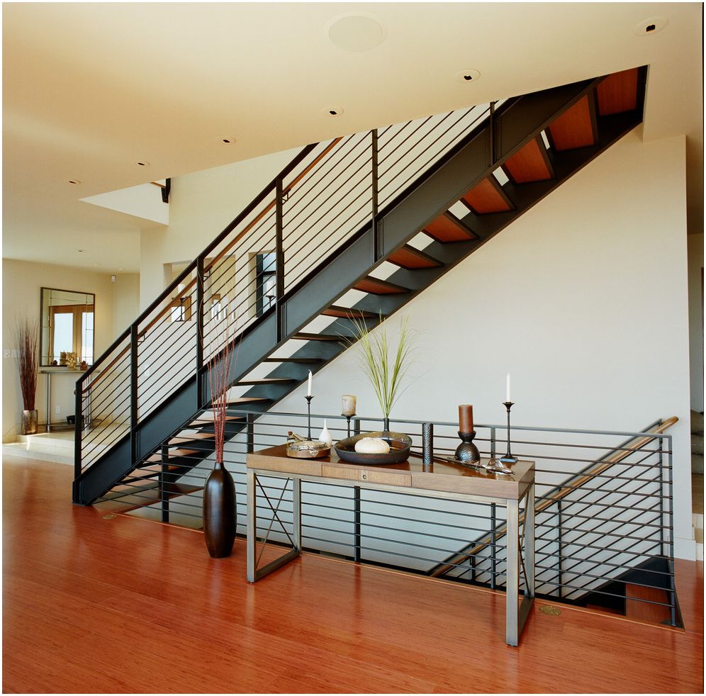
Brick apron on the wall
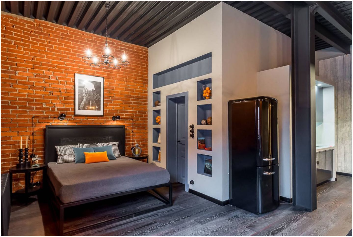
Both the original and the tiled brick always look beautiful and create a modern vibe, which is why you should consider it as a wall material in your kitchen. You can leave the brick in its original color or paint it. The material must be impregnated to make it resistant to moisture and dirt. The brick work wall looks great in rustic, industrial, modern and classic interiors. A brick apron will perfectly match the facades of both wood and colored MDF.
Choosing an apron in the kitchen: decor in different styles
Choosing an apron in the kitchen: decor in different styles
What colors to avoid
The walls of the kitchen are not recommended to be painted in gray, black and blue. The latter has a calming and relaxing effect, so it is more suitable for rooms such as the bedroom. However, if only the working area above the stove is made in a similar color, and the cabinet facades are selected in light neutral colors, then a wonderful interior design can be obtained..
Choosing an apron in the kitchen: decor in different styles
You can choose from bright, saturated colors or more subdued hues. Each of them will revive the interior and bring a dose of positive energy. It will also give the kitchen an original character..
Choosing an apron in the kitchen: decor in different styles
Advice! Color can be used as an accent, for example, only on a kitchen apron. You can go even further and make the whole room in monochrome. So, in the first case, you should not have any serious problems, but in the second it is worth remembering not to overdo it with too many colors in one room. Thus, creating a colorful mess is very easy..
Choosing an apron in the kitchen: decor in different styles
There are really many possibilities to combine colors in one room. It is important that they are correctly selected and have the correct proportions..
Choosing an apron in the kitchen: decor in different styles
Choosing an apron in the kitchen: decor in different styles
Choosing an apron in the kitchen: decor in different styles
Choosing an apron in the kitchen: decor in different styles
Choosing an apron in the kitchen: decor in different styles
Choosing an apron in the kitchen: decor in different styles
Choosing an apron in the kitchen: decor in different styles
Choosing an apron in the kitchen: decor in different styles
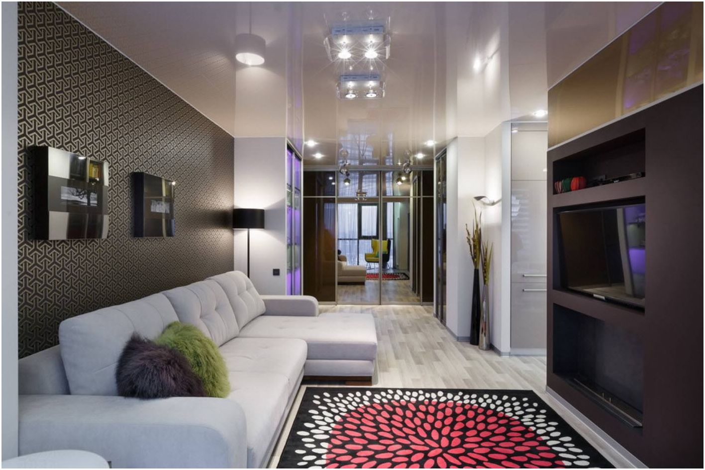
Choosing an apron in the kitchen: decor in different styles
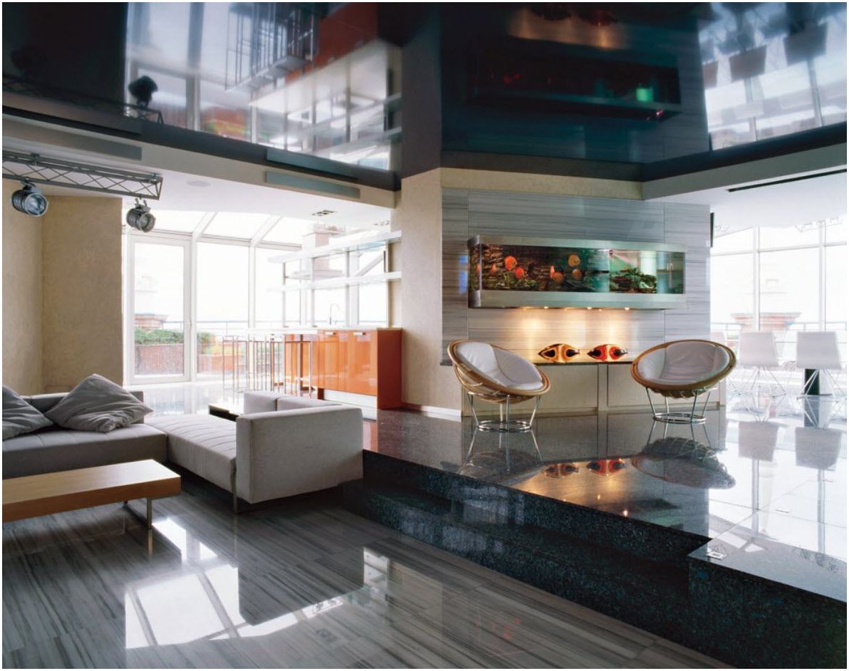
Choosing an apron in the kitchen: decor in different styles
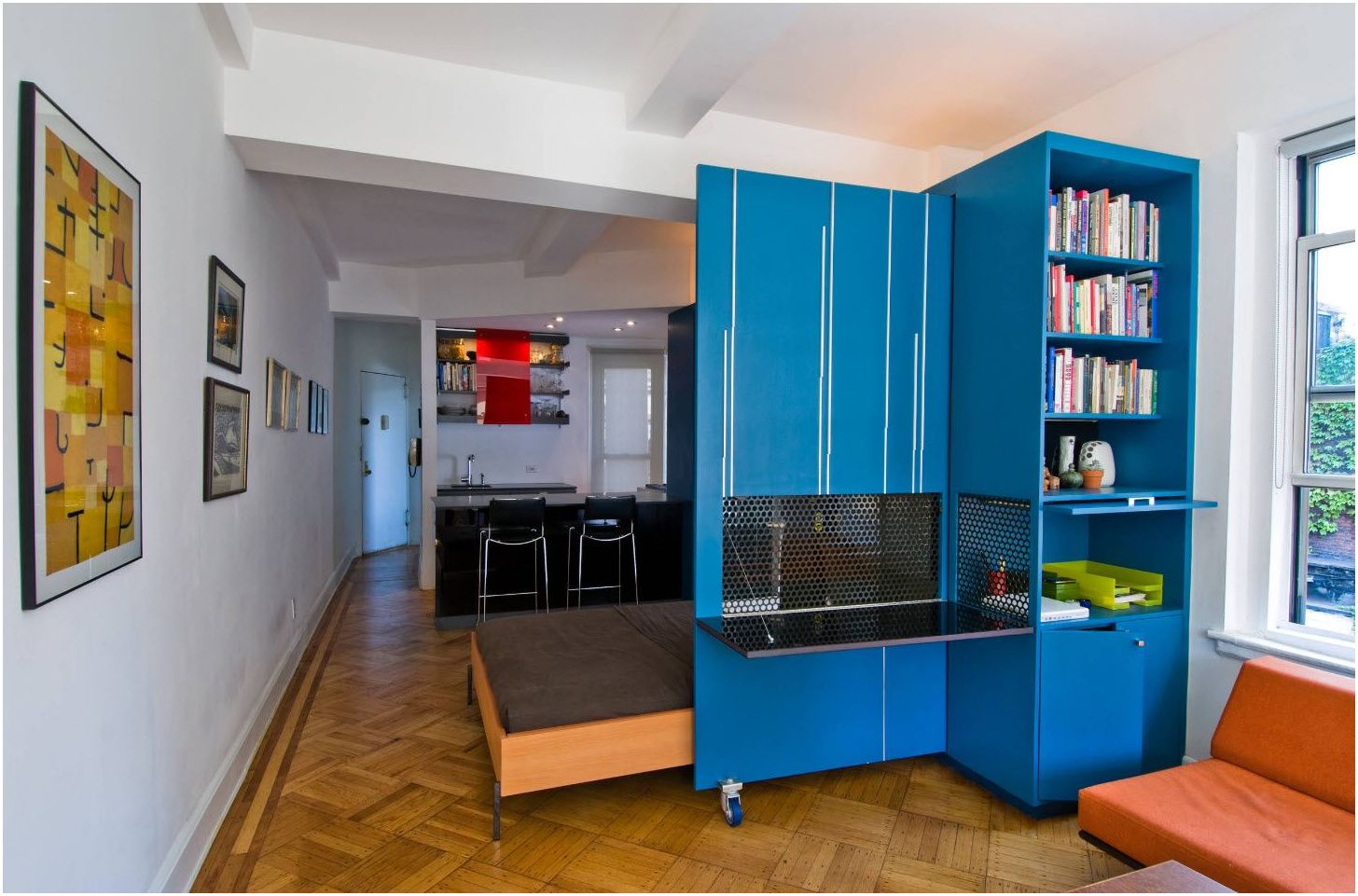
Choosing an apron in the kitchen: decor in different styles
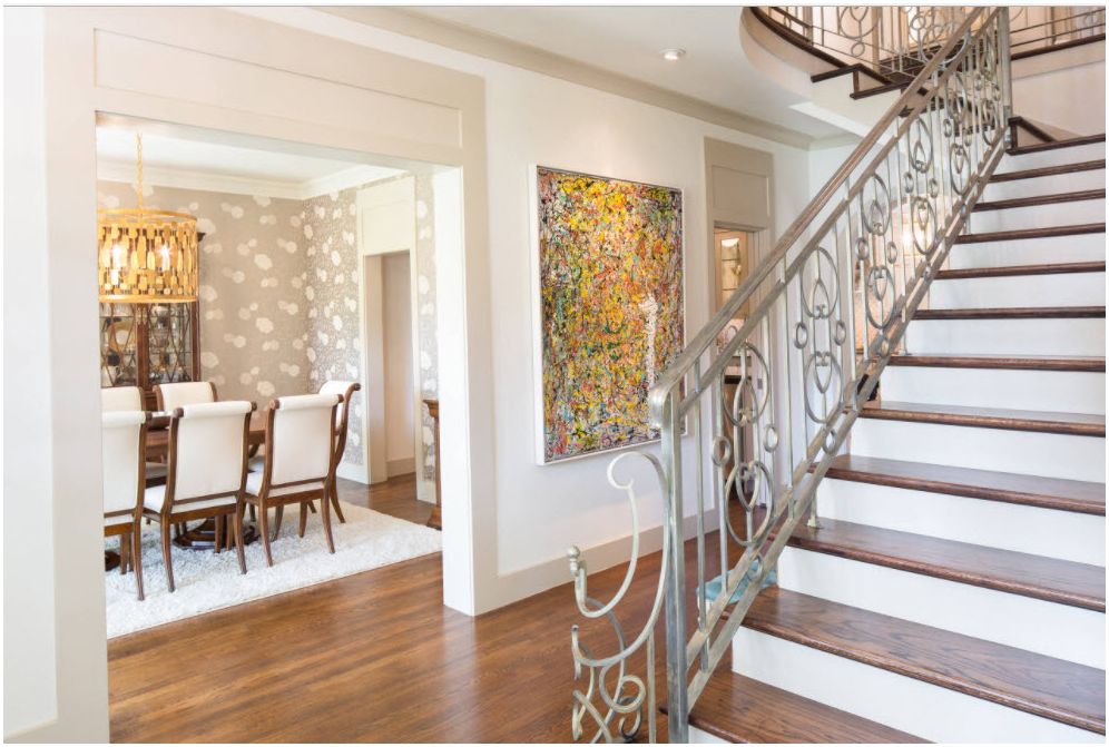
Choosing an apron in the kitchen: decor in different styles
Choosing an apron in the kitchen: decor in different styles
Choosing an apron in the kitchen: decor in different styles
Choosing an apron in the kitchen: decor in different styles
Choosing an apron in the kitchen: decor in different styles
Choosing an apron in the kitchen: decor in different styles
Choosing an apron in the kitchen: decor in different styles
Choosing an apron in the kitchen: decor in different styles
Choosing an apron in the kitchen: decor in different styles
Choosing an apron in the kitchen: decor in different styles
Choosing an apron in the kitchen: decor in different styles
Choosing an apron in the kitchen: decor in different styles
Choosing an apron in the kitchen: decor in different styles
Choosing an apron in the kitchen: decor in different styles
Choosing an apron in the kitchen: decor in different styles
Choosing an apron in the kitchen: decor in different styles
Choosing an apron in the kitchen: decor in different styles
Choosing an apron in the kitchen: decor in different styles
Choosing an apron in the kitchen: decor in different styles
Choosing an apron in the kitchen: decor in different styles
Choosing an apron in the kitchen: decor in different styles
Choosing an apron in the kitchen: decor in different styles
Choosing an apron in the kitchen: decor in different styles
Choosing an apron in the kitchen: decor in different styles
Choosing an apron in the kitchen: decor in different styles
Choosing an apron in the kitchen: decor in different styles
Choosing an apron in the kitchen: decor in different styles
Choosing an apron in the kitchen: decor in different styles
Choosing an apron in the kitchen: decor in different styles
Choosing an apron in the kitchen: decor in different styles
Choosing an apron in the kitchen: decor in different styles
Choosing an apron in the kitchen: decor in different styles
Choosing an apron in the kitchen: decor in different styles
Choosing an apron in the kitchen: decor in different styles
Choosing an apron in the kitchen: decor in different styles
Choosing an apron in the kitchen: decor in different styles
Choosing an apron in the kitchen: decor in different styles
Choosing an apron in the kitchen: decor in different styles
Good luck!

