Stylish small size, 38 square meters
How to make a small interior elegant and stylish? Often this question fades into the background when it comes to the practical use of space. I would like to make the small size as practical as possible, but do not forget about the attractive design. We found alternative solutions in one small but very stylish apartment.
1. Glass elements visually multiply the space
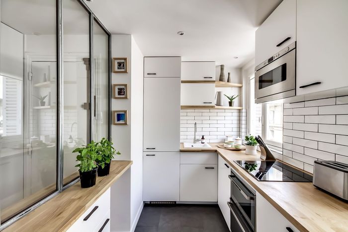
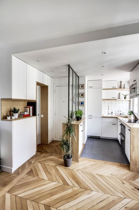
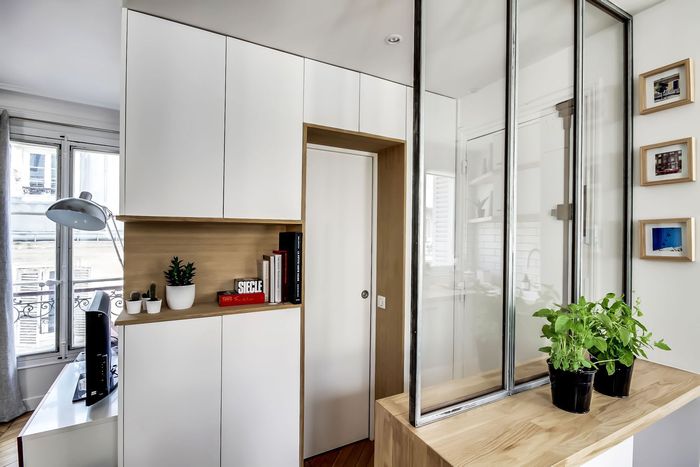
Glass partition separates the kitchen area from the hallway
To visually enlarge a small interior, it is necessary to use glass surfaces for its design. This could be a partition, a glass-top coffee table, a vase, or framed posters. Glass does not make the space heavier, zoning the space if necessary, and also reflects and multiplies the light.
Glass element as a zoning partition
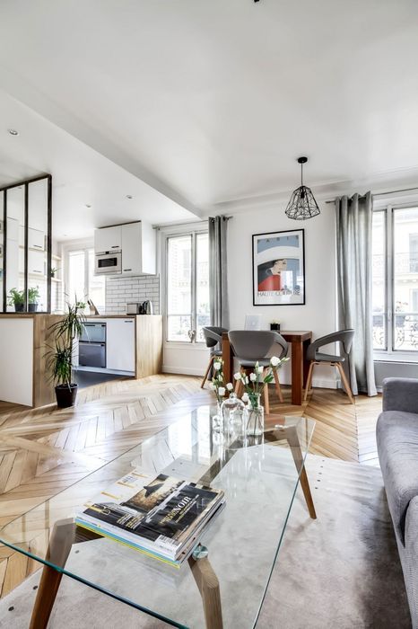
In this small apartment, this technique was used in full: the kitchen was separated from the hallway by a glass partition, a table with a transparent surface was placed in the living room, and the walls were decorated with posters and photographs under glass.
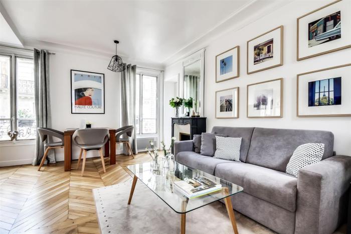
There are many posters on the walls under glass
2. Posters, wall tiles and even flooring can affect the visual enlargement of a room.
Small kitchen interior
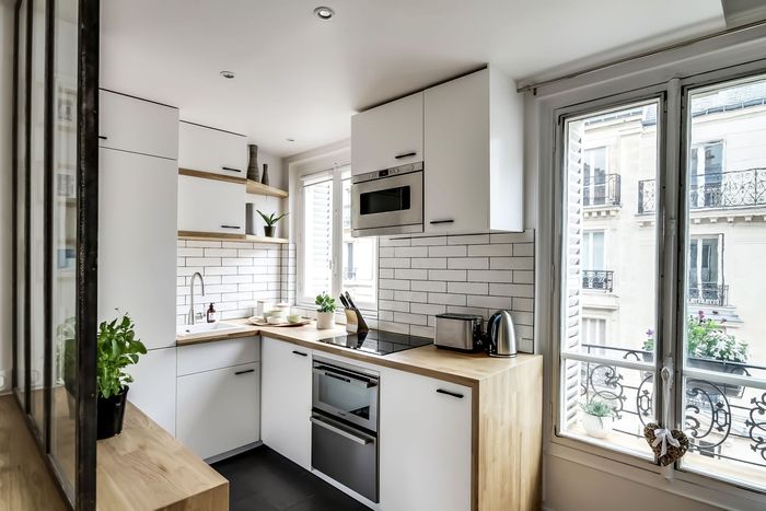
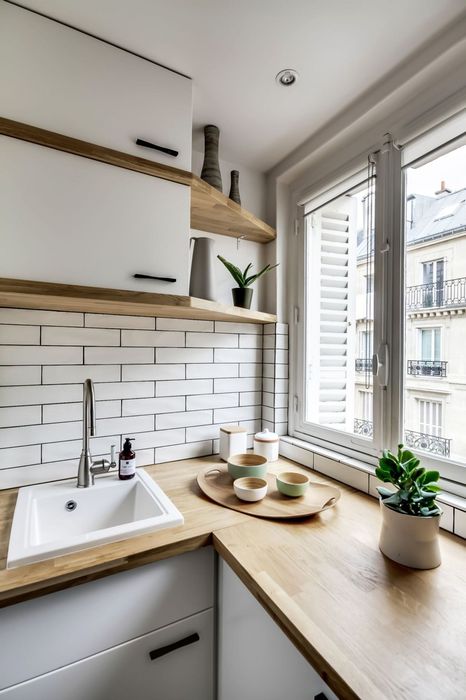
The apartment that we turned our attention to today is located in Paris. Its area is limited to 38 square meters, but thanks to visual techniques, it seems larger. The kitchen area was designated by elongated rectangular tiles, which visually expand the walls and lengthen the room..
Horizontal tiles work to increase the visual space
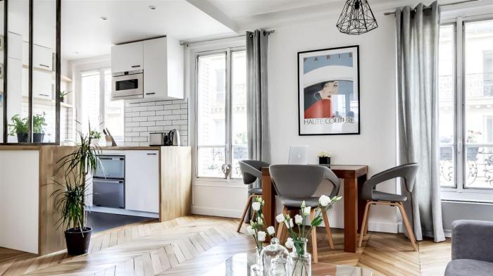
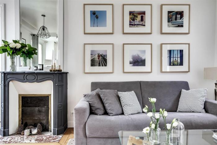
In the living room area, posters in square frames hang in several rows, which plays to improve the proportionality of the room. Even the flooring in this small size is aimed at visually changing the space for the better. Herringbone parquet laying smooths out the non-standard layout of the apartment, and sets the dynamics.
Square-framed posters make the room more proportional
3. Correctly selected furniture makes the interior lighter
Properly selected furniture makes the interior lighter
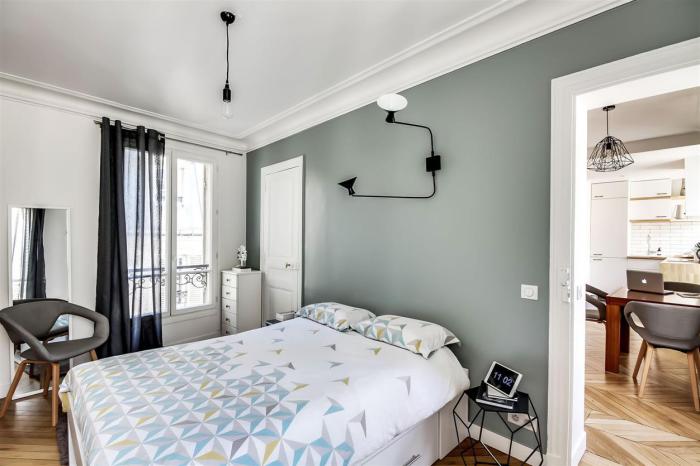
When space is limited, furniture should be extremely light in design and in no way make the space heavier. The architect Pierre Petit, who was involved in the design, took this moment into account and chose suitable laconic options. For example, in the dining area, chairs were placed not with monolithic backs, but with stylized ones. In the bedroom there is a visually airy geometric curbstone near the bed, and in the living room there is a translucent table.
Transparent coffee table looks weightless
4. Hidden storage systems make the interior tidy
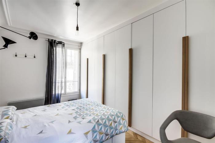
The interior always seems more neat and stylish if there is nothing superfluous on horizontal surfaces. In a small apartment, you need to adhere to a constant order, this will help to make the space visually larger. in a Parisian apartment with storage systems they acted simply – they were hidden in a wardrobe, which is located in the bedroom.
Hidden storage systems keep the interior tidy
5. Calm colors will give a sense of harmony
For the decoration of this apartment, extremely simple and frequently used shades were used. But the interior doesn’t look like a cliché and it is quite interesting. All thanks to the correct use of a simple yet stylish color scheme. The shade of natural wood and white are used in equal amounts, and to complement this tandem, a noble gray color scheme was included. In addition to it, accents were added with the help of black accessories and lighting fixtures..
Hallway interior
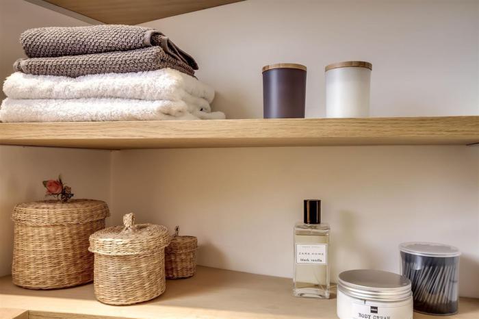
Storage in the bathroom
There is an opinion that monochrome interiors look boring. We decided to check it out and picked up 10 cool examples of such spaces in which you obviously will not get bored..

