When creating a design for a children’s bathroom, it is very important to provide for the possibility of changing it without unnecessary effort, because children grow quickly, and after a few years their interests and preferences change.
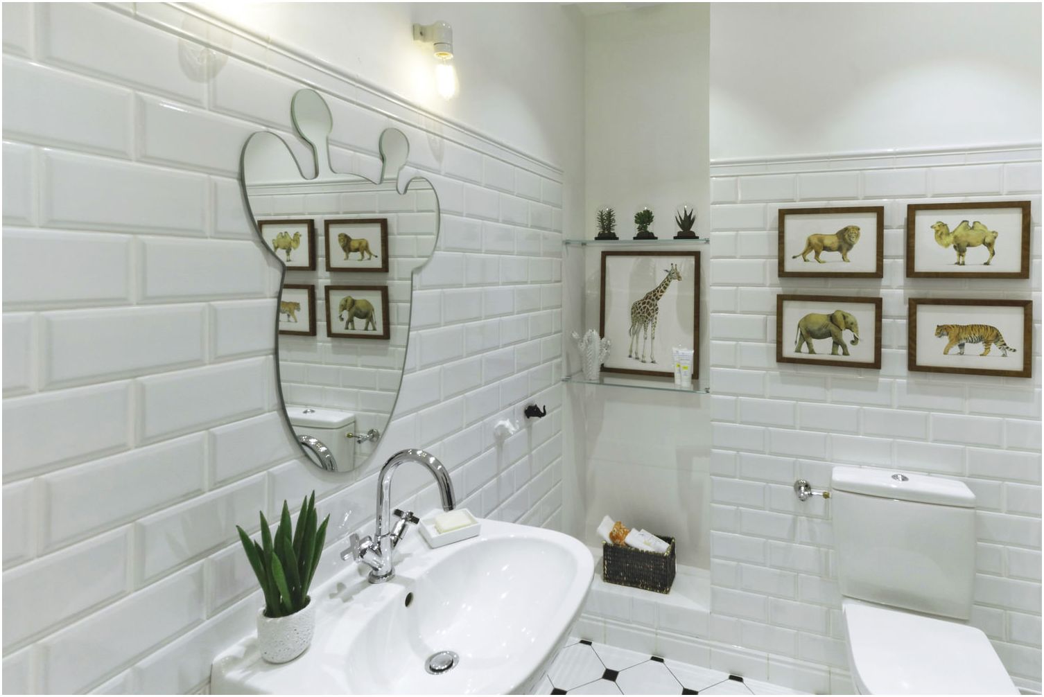
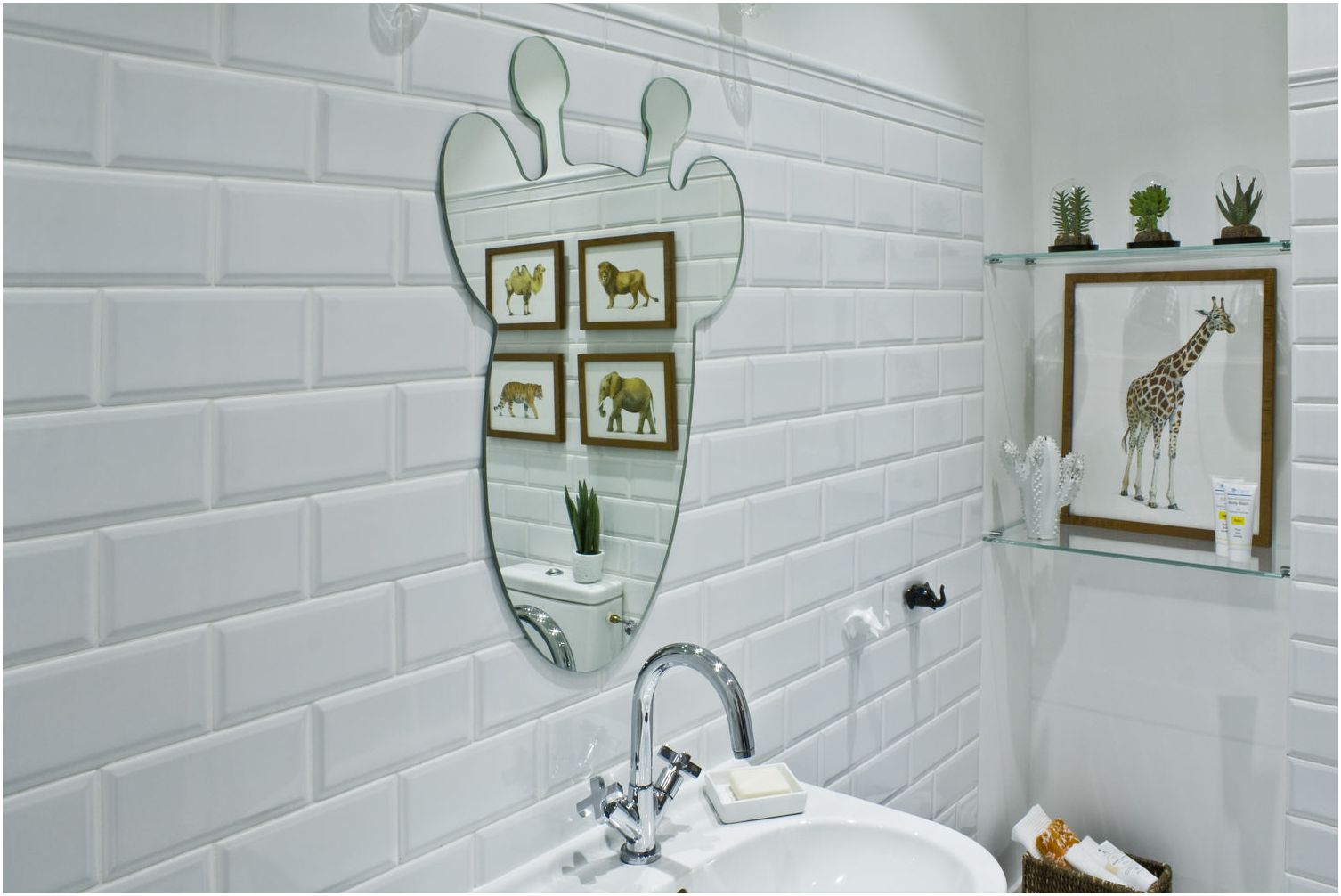
In order for the bathroom to always please its owners, you need the ability to easily change the interior. This can be done by changing “baby” mirror to a more strict one, and replacing posters of animalistic content with something more appropriate for adolescence.
Style features
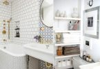
Since the entire apartment is designed in a classic style, the bathroom should not be in dissonance. White color, correct proportions, symmetrical arrangement of the main elements – that’s what allowed the bathroom to harmoniously fit into the overall interior.
Color palette
White is used as the main color in the design of the children’s bathroom. It is not only a color that emphasizes cleanliness, the white surfaces of the walls expand the space and create a sense of celebration..
Black was used as an accent color, in addition, the interior was supplemented with warm beige in the posters and the herbaceous green tone of living plants, which makes it warm and cozy.
Decoration Materials
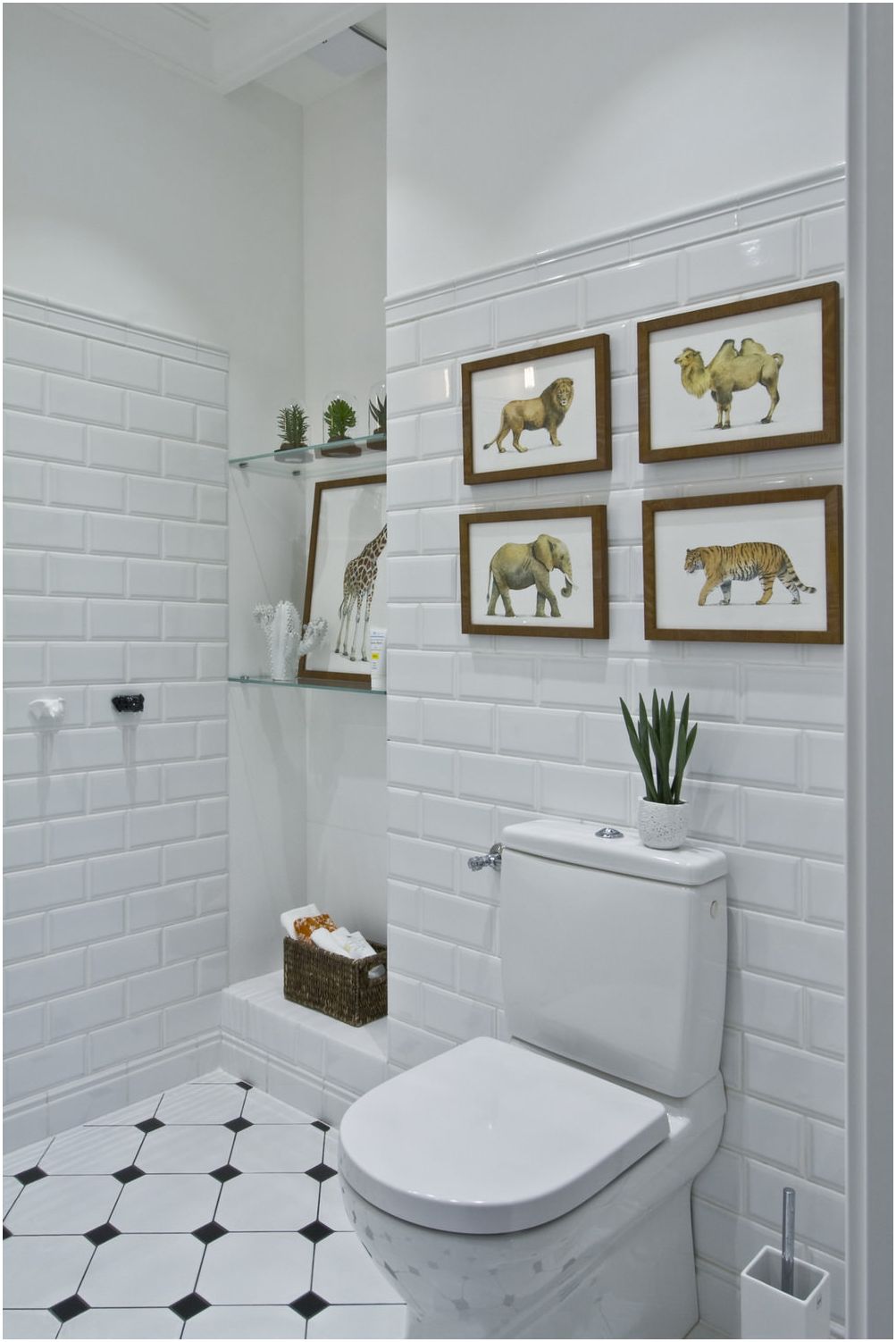
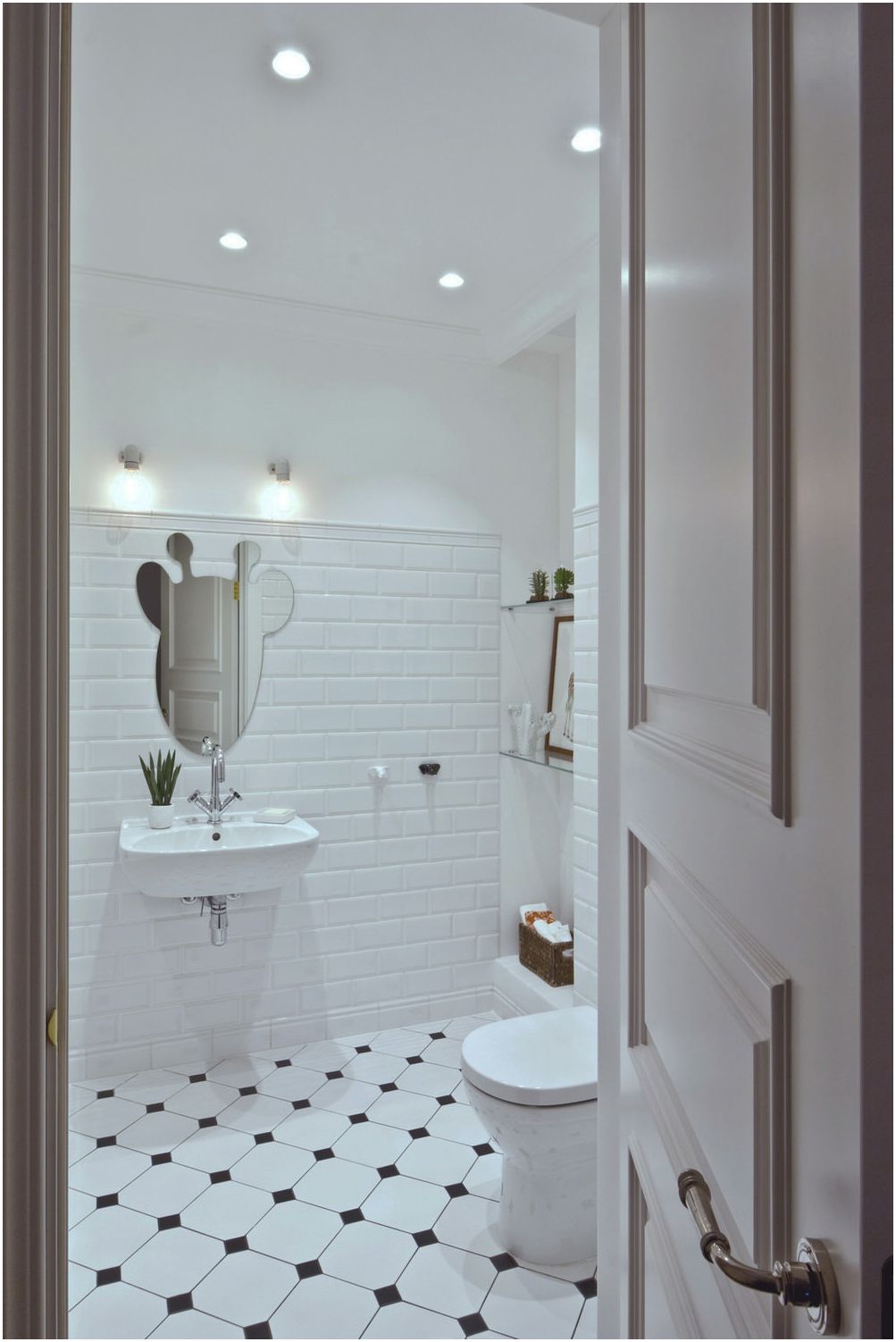
The walls were laid with tiles in the shape of bricks. It gives dynamism and expressiveness to the interior..
So that there is no feeling of enclosed space and “overhangs” the ceiling, the walls were laid out with it at the level of a person’s height. Everything above is covered with moisture resistant paint. An expressive accent in the design of a children’s bathroom – floor tiles “checkered”.
Equipment and decoration
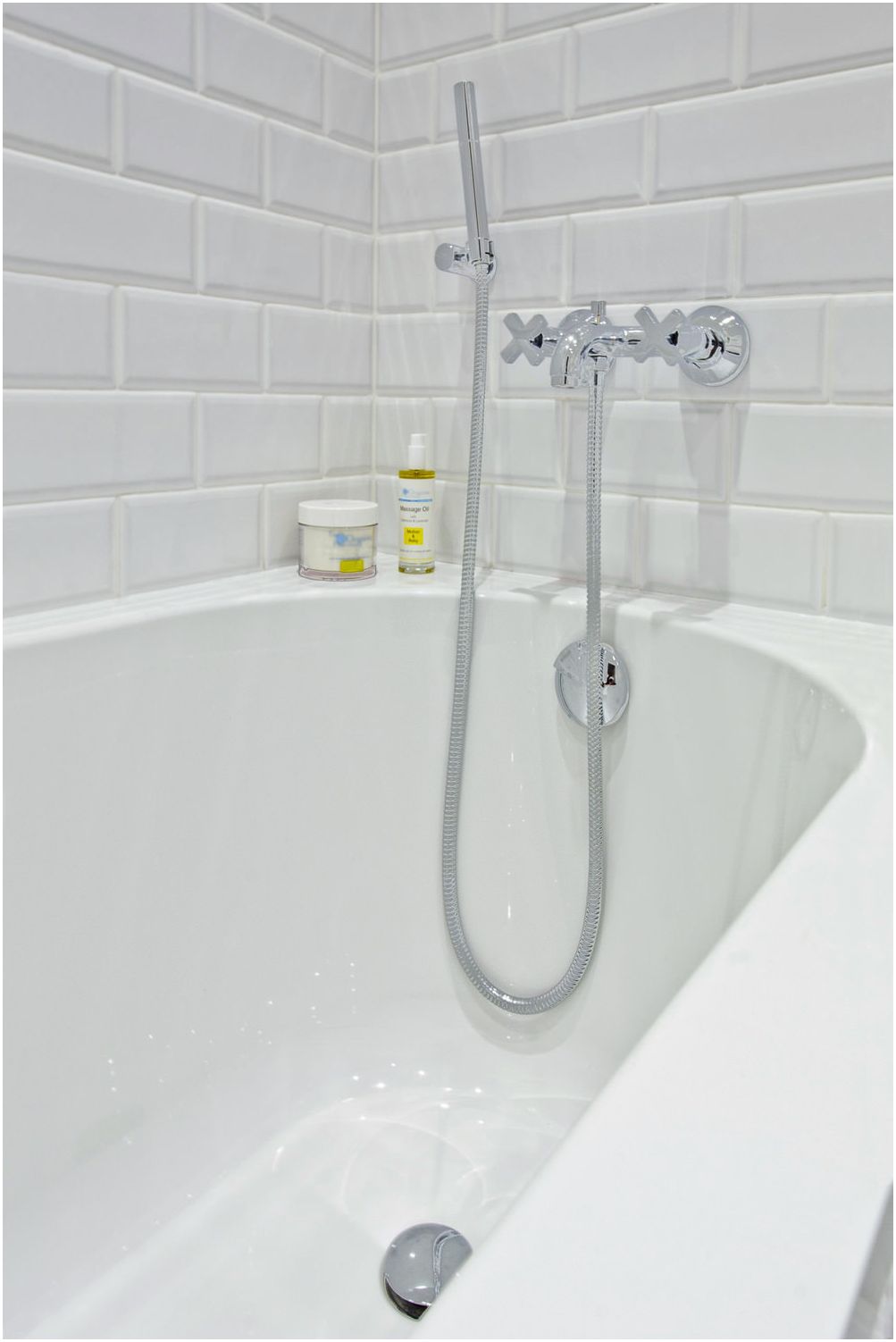
The highest quality materials and plumbing fixtures from well-known companies were used for the bathroom equipment. They represent a classic approach to interior design: dignity and reliability.
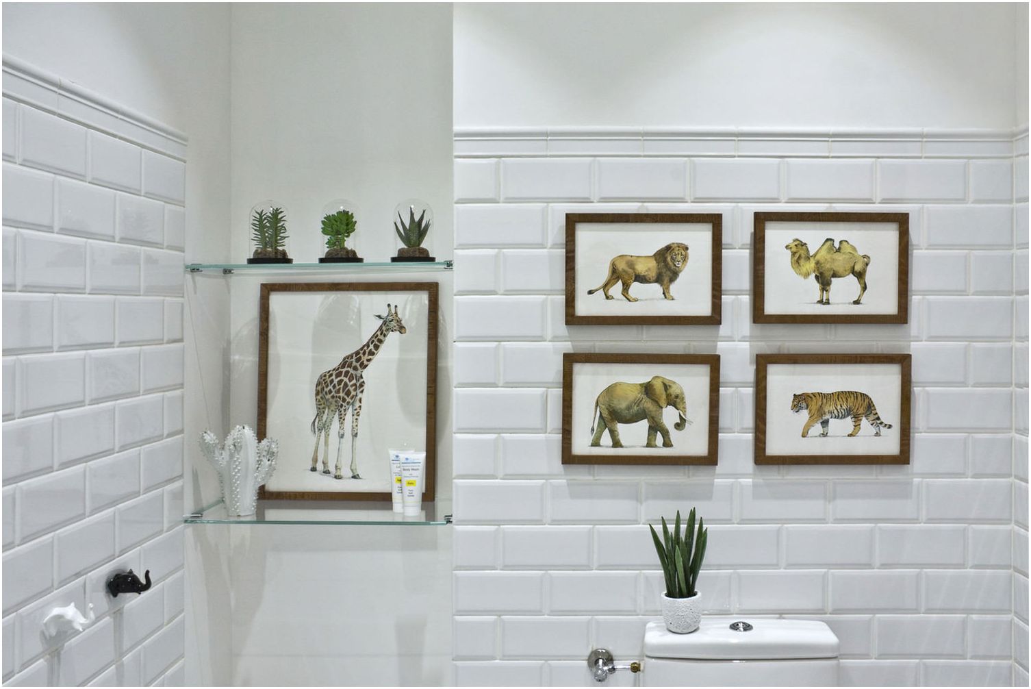
As a decor in the design of the children’s bathroom, objects were used that can be easily replaced if necessary, while completely changing the interior of the room. The paintings on the walls were created by the artist on a special order.
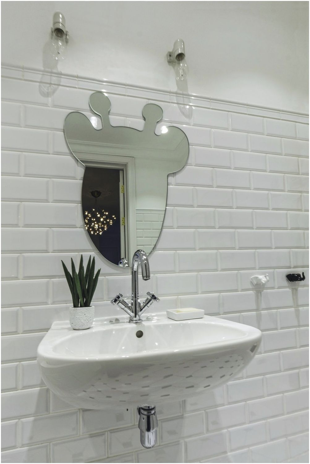
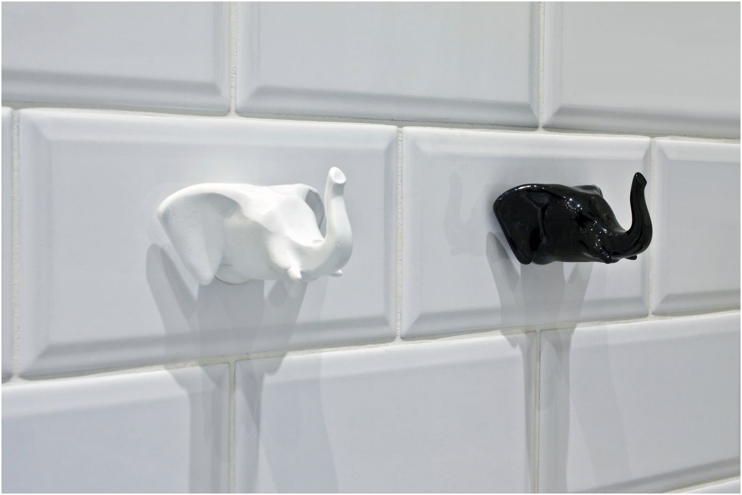
The mirror was carved in the workshop according to the designer’s sketch. Even the hooks on the wall, where it is convenient to hang a towel, are not simple – they are made in the shape of an elephant’s head, continuing the theme started by the artist in her paintings.
Storage space
The design of the children’s bathroom provides for a small niche with built-in shelves, where you can place the essentials, as well as put decor items.
In this case, there is no need for voluminous wardrobes, since the apartment has another bathroom in which appliances are installed and it is possible to place everything that the owners consider necessary.
Lighting
The light scheme is standard for such premises and is rather austere: spots on the ceiling provide general uniform illumination, and two simple lamps near the mirror allow you to see yourself in all details.
Architect:
O-deco
Country: Russia, Moscow
Area: 4.5 m2

