One-bedroom apartment project in Singapore
When decorating an interior, it is important to make it not only beautiful and comfortable. It should not be boring and monotonous, otherwise the monotony will quickly tire the owners of the apartment. How not to overdo it with paints and create a moderately bright interior? To answer this question, we decided to consider an unusual project of an apartment located in Singapore.
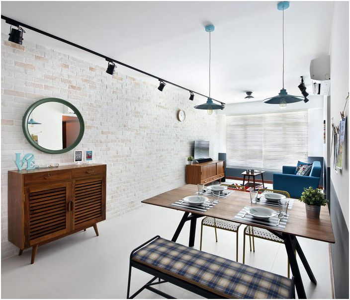
The project is designed for an apartment with an area of 85 square meters
A small Asian city, which is also a state, is famous for its creativity. Due to the mixing of religions and national groups, a rather colorful culture has formed in the country. It manifests itself in all areas of Singaporean life, including interior design. The Versaform studio project is a great example of this. It is designed for a two-room apartment with an area of 85 square meters. According to the designers, it takes no more than six weeks to complete the project..
It takes only 6 weeks to complete this interior
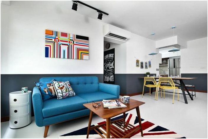
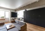
The designed interior has room for loft and vintage style elements. They harmoniously coexist, complementing each other. To deprive the space of rigor, the designers decided to decorate it with bright colors. In order to be practical and save money, they decided to abandon the wallpaper – all the walls will be covered with washable paint. So that the background of the living-dining room does not look too boring, it was decided «dress» in white top and black bottom. This is how the boundaries of space are visually erased..
Excellent color scheme
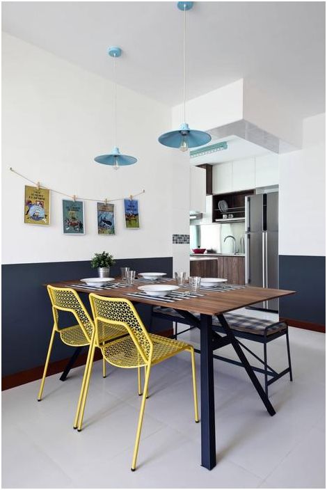
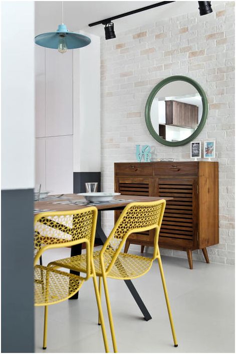
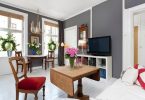
On such a canvas, color spots stand out favorably – a blue sofa and lamps, yellow chairs, a bright picture in the living area.
Bright yellow chairs in the interior
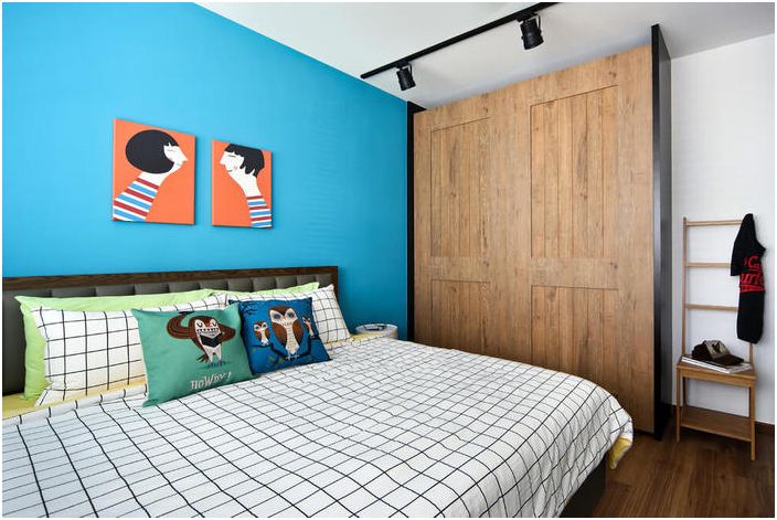
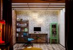
Compared to this room, the bedroom is generally a solid color spot. Several attractive shades (copper, blue, green and brown) met here at once, which create a good ensemble.
Bedroom interior
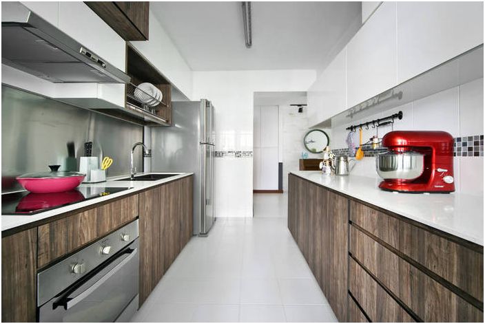
But the kitchen is the most restrained room in terms of color. Apparently, they will not just cook on it, but meditate. By the way, it is precisely due to light shades and glossy facades that it seems more than it really is.
A place for meditation and food preparation
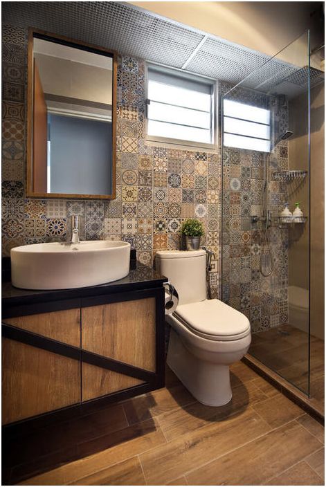
Even the bathroom is unusually and brightly decorated in this project. They decided to revet it with stylish Moroccan patchwork tiles. Quite a creative and bold decision. Porcelain stoneware under a tree will be laid on the floor here, and the curbstone will be made to order.
Bathroom interior
What to take note of:
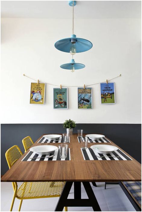
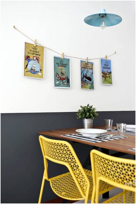
• The yellow chairs in the dining area are not accidental. This color is known to stimulate appetite.
• If it is not possible to expose a brick wall, then it can be replaced with an artificial facing stone. The difference between surfaces is almost imperceptible.
• White glossy fronts in the kitchen can make the space lighter and more visually spacious.
• It is relevant to use blue on the accent wall in the bedroom, as it visually deepens the space.
• Patchwork tiles are good not only on the kitchen backsplash, and they look quite interesting in the interior of the bathroom.
Yellow chairs in the dining area
In recent years, the patchwork technique has attracted the attention of interior designers, cladding and carpet manufacturers. But most importantly, it allows you to make the space stylish with the lowest cost..

