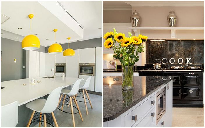
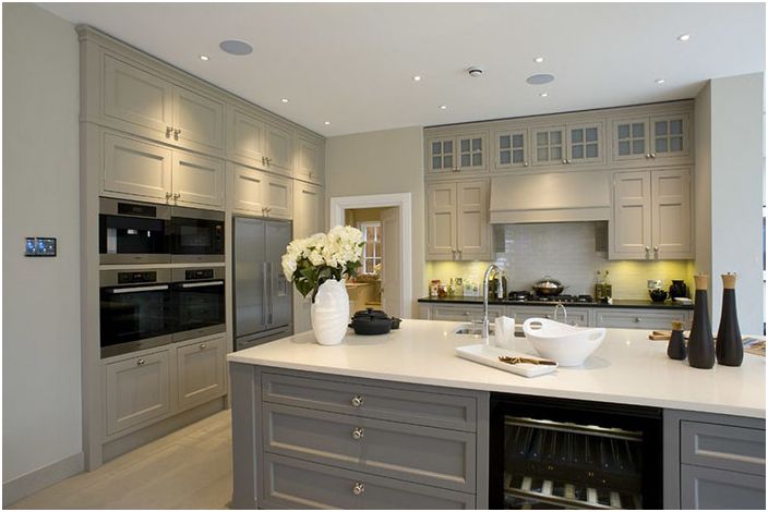
Designer secrets: how to make a picture out of the kitchen
It is not so difficult to come up with and equip a kitchen, how much to equip it, turn it into a cozy and functional place worthy of a magazine cover. This is especially true for open-plan houses, where everything is in plain sight, and there is no way to close the door and hide something unsightly. We offer 10 secrets from designers to help make a picture out of the kitchen.
Add an accent wall
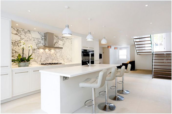
Kitchen interior by Arc8 Projects Ltd.
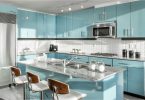
Most often, the kitchen is decorated in light, mostly white, colors, so something special is simply needed in it, for example, a shiny marble kitchen apron. He is always fashionable, popular and also practical. Perfectly fits the interior of a modern luxury kitchen.
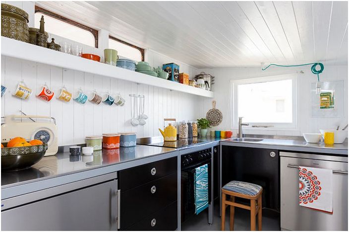
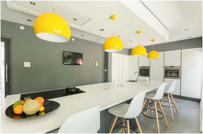
Bright accents
Kitchen interior by Chris Snook
For monochrome colors, a variety of colors can be added with accessories. The result is a pleasant bohemian vibe. It is recommended to use three to four tones of the same saturation..
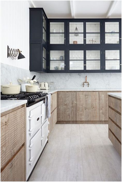
Mixing materials
Kitchen interior by Blakes London
It is not necessary for the top and bottom cabinets to have the same finish. In the kitchen, the rough wooden bedside tables at the bottom will be in perfect harmony with the classic showy cabinets above. The softness and warmth of wood is also ideal for creating color contrast.
From the very bottom to the very top
Kitchen interior by Inspired Dwellings
To give your kitchen a modern and sleek look, you need to optimize the storage of all your kitchen utensils. For this, lockers to the very ceiling are wonderful. In addition, they will help create a more orderly look and help to hide even those items that are rarely used. Grace can be added with glazed cabinet doors.
Lighting
Kitchen interior by Pushh Construction
The kitchen must have directional lighting. Luminaires should not only be beautiful, but also combine practicality with visual effect, enhancing the merits of the chosen color palette for the kitchen.
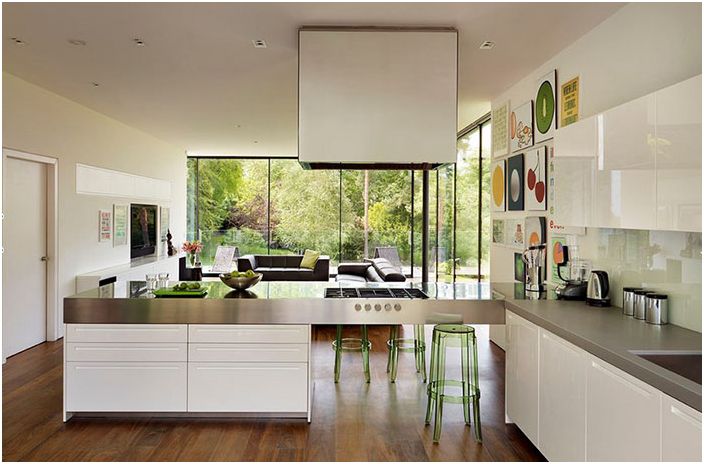
Create a gallery
Kitchen interior by Gregory Phillips Architects
With a huge amount of white, reflective surfaces, good lighting, the kitchen will turn into an ideal place where you can organize an entire art gallery. You can fully express your individuality and demonstrate your taste. True, when equipping a gallery on the wall, you need to remember that it should not be located next to a sink or stove.
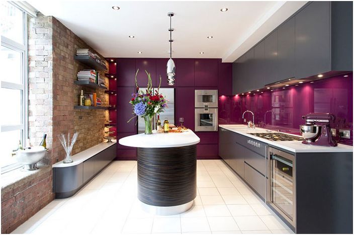
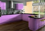
Saturation of colors
Kitchen interior by Increation
It is worth experimenting with bright and unexpected colors. A rich lilac will look wonderful against the background of open brickwork and dark gray furniture. Reflections of glass and acrylic help to complement a unique color scheme.
Removing the mess
Kitchen interior by Design A Space
The work surface and dining table are used for work and demonstration of their results, and not for storing all kinds of kitchen utensils, among which there may be receipts, and charging, and a laptop. Anything that is not used every day must be hidden. Instead, it is better to put a bouquet of flowers or a beautiful houseplant..
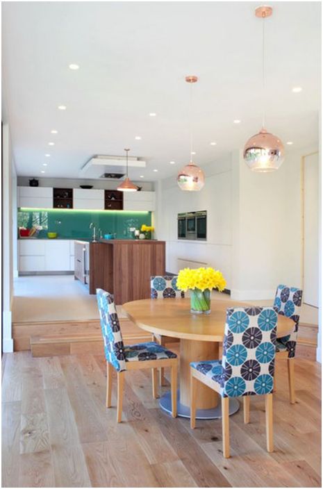
Changing styles
Kitchen interior by APD Interiors
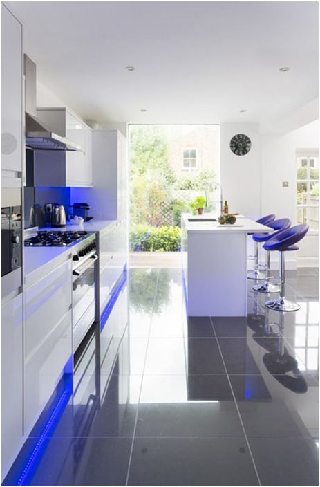
Minimalist white furnishings, LED lighting across the floor and under the wall cabinets create a unique ambiance and depth. Do you want something different? Change the backlight color depending on the mood and the occasion. Programmed lighting allows you to change the look of the kitchen with a simple push of a button.
The rule of three
Harvey Jones Kitchens
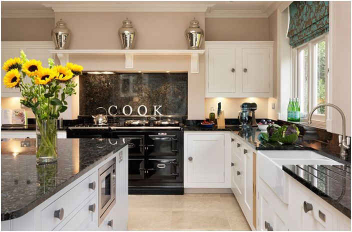
For accessories such as vases and jars, there is a rule of three. They are recommended to use an odd amount to maximize the effect. You can create a collection of three cute blue vases or large silver jars of different heights and shapes.
If the kitchen is of non-standard size, then there are more difficulties with its design. We offer 10 professional tips for planning narrow kitchens.

