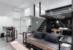

Designer Tips: 4 Ways to Spice Up All White Kitchen Designs
Today, according to research, about 49% of kitchens are presented in white. But if you want to get rid of the feeling of sterility and being in a hospital ward, then you should get acquainted with some tricks. With the help of some details, it will turn out to revive the completely white interior of the kitchen..
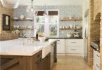
1. Tiles

Kitchen interior by Melton Design Build
Designer: Rene Urbanovich (MeltonDesignBuild)
Location: Boulder, Colorado
Size: 16.5 sq. m;
Year of construction: 1975
Features. The walls of the kitchen are tiled with handmade tiles, the size of each tile is 20×20 cm.The owners of the house decided to bring some colors to the kitchen decor in an interesting way, while at the same time trying to modernize the design of the room.
Clients’ requirement. Modern, thoughtful, comfortable and easy to clean, family-oriented interior with durable surfaces.
Goals. In the 70s, white was taken as the basis for kitchen design. This is reflected in the stark white tiles, worktops and equipment. Facing the autonomous working area with colored tiles appeared later.

Kitchen interior by Melton Design Build
Positive. Before the renovation, the kitchen seemed dark with an enclosed space. The designer removed the walls and old lighting, refurbished the plaster on the ceiling and installed new lighting, equipped the pantry and revamped the self-contained work area. The placement of cabinets around the kitchen perimeter has a positive impact on functionality and spaciousness. Since the kitchen equipment remained in the same places, this made it possible to save on additional work related to remodeling and additional installations.
The designer’s secret. Design success is based on two criteria: functionality and beauty. According to Urbanovich, the design of the kitchen is characterized by increased storage space for kitchen utensils and an open plan, which allowed for a spacious kitchen by combining the kitchen, dining room and living room. The use of kitchen-like cabinets throughout the home created a unified concept.
Costs and savings. Customers managed to save money on tiles and kitchen equipment, so they had the opportunity to purchase expensive, high-quality materials for countertops.
Council. According to Urbanovich, the use of a limited set of colors allows the decor to be perfect for a long time. The white background of the interior makes it possible to periodically change the decor if desired.
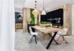
2. Bookshelves

Kitchen interior by Bunker Workshop
Designer: Chris Greenawalt (BunkerWorkshop)
Location: South End, Boston
Year of construction: 1900
Features. Tall black bookshelves. The designer’s goal was to minimize the amount of white in the kitchen interior. In his opinion, if you use contrasting elements, the decor will sparkle in a new way. White kitchen cabinets look sleeker next to black bookshelves. In addition, the shelves enrich the design with new textures..
Clients’ requirement. The previous layout was not functional, and the room itself seemed cramped. Customers wanted to improve the layout, optimize storage function and find space for bookshelves.

Kitchen interior by Bunker Workshop
Goals. Customers opted for bookshelves and new surfaces. The designer began his work with a self-contained work area in the center of the kitchen. It is used to prepare food for the cooking process, since there is a sink and a stove – the main equipment. The family also dines in this area. Installing a self-contained work area improves the layout and makes the kitchen more ergonomic.
How the kitchen is used. This space is used as a kitchen, dining room and library..
Designer secret: Minimalism in design is a positive thing, but this style without periodic variety quickly becomes boring.
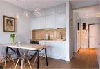
3. Autonomous working area

Kitchen interior by Effect Home Builders
Designer: SydneyBond (Effect Home Builders)
Location: Sherwood Park, Alberta, Canada
Size: 23 sq.m.
Year of construction: 2014
Features. A unique self-contained work area with a birch worktop. The granite black surfaces of the perimeter lower kitchen cabinets add contrast. The light blue color of the wall fragment above the sink matches the color of the stand-alone work area and continues as wall décor throughout the floor, creating a unified image. This color is present in the decor of the whole house..
Clients’ requirement. Spacious room with many windows. In the kitchen, customers store self-grown vegetables and fruits, from which they prepare every day. Therefore, the kitchen must have enough storage space..

Kitchen interior by Effect Home Builders
Goals. The designer started by installing the floor, which is made of walnut wood. Then she turned to the white kitchen cabinets. Next came the work surfaces, then the tiled protective apron. Last but not least, the designer got down to decorative work and took up lighting. The cabinets store kitchen utensils, shelves with cookbooks, and accessories behind glass doors. The designer really likes the interesting combination presented by a massive sink with an apron and an original mixer, and such modern elements as kitchen equipment and granite surfaces..
The designer’s secret. As a decor for white tiles, the designer chose a contrasting black grout for joints. This minor touch plays an important role, as it contrasts with the white background, and also serves as a link between completely white cabinets and black work surfaces..
Problem. When the cabinets were made and installed, the sink purchased by the hostess of the house did not fit. A massive sink weighs a lot, which means that the base on which it is installed must be strong. Therefore, it was necessary to think about it in advance..
4. Combination of materials – used wood, copper and iron

Material combination – used wood, copper and iron
Designer: Michael and Betty Terry
Location: Newport Beach, California
Size: about 31 sq. m.
Year of construction: 2015
Features. Used timber beams. Copper hood with white painted timber frame. Above the upper kitchen cabinets is a superstructure with fine wire mesh. The freestanding work area is painted gray and the table top is made of white marble. Chairs with soft cushions that fit perfectly in design were found in the house. Along the perimeter of the kitchen are lower kitchen cabinets with soapite countertops contrasting with the white marble free-standing marble countertop. The white painted brick wall, as an attribute of the rustic style, contrasts favorably with the moldings and the lamp in the form of glass domes. An iron door leads to the patio, which is in the backyard..
Clients’ requirement. A rustic kitchen with a nautical theme. This room is not only located in the center of the house, but is also its highlight..
Costs and savings. Customers love the look of the steatite countertops found on the lower kitchen cabinets. In addition, this material looks very similar to granite, but much cheaper. Most of the budget went to the purchase of wooden beams, decorative fittings, custom-made lockers, and a copper hood. The iron door was the most expensive.