Expanding the House Up: Victorian Home Renovation
After the birth of their second child, the family felt cramped in their old Victorian home. Instead of moving to the suburb of Santa Barbara, she decides to stay downtown and just expand the space. It is very conveniently located close to parks, restaurants, major attractions and the library. Now all they were missing was more space.
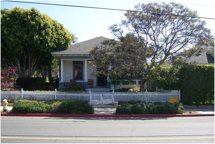
House before reconstruction
Residing in the house: Sherri Brian and Tim Duvar, two daughters,
Location: Santa Barbara, California
Size: 135 sqm; three bedrooms, two bathrooms
The couple purchased this home as soon as they got married, falling in love with its history, character and great location. After the birth of the second daughter, it became clear to everyone that there was not enough room for a comfortable life, so it was decided to expand.
They turned to an architect for help, who decided to expand the living area with an attic. It was planned to create a home with three bedrooms, two bathrooms, which will be equipped with all modern comforts, while maintaining the charm of the house. I had to donate one bedroom on the first floor, but I managed to equip two bedrooms on the second.
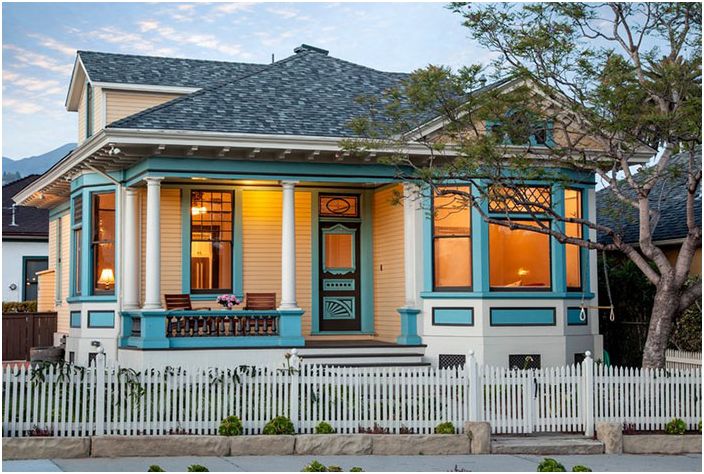
House after reconstruction
Fortunately, thanks to the willingness of the home owners and their financial situation, it was possible to preserve the originality of the historic facade of the house..
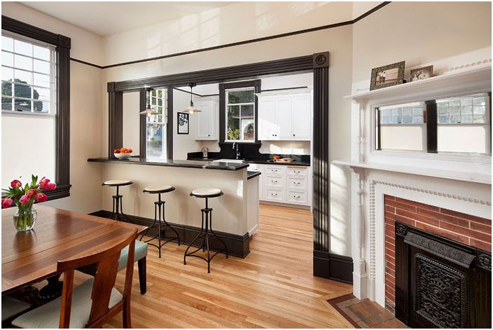
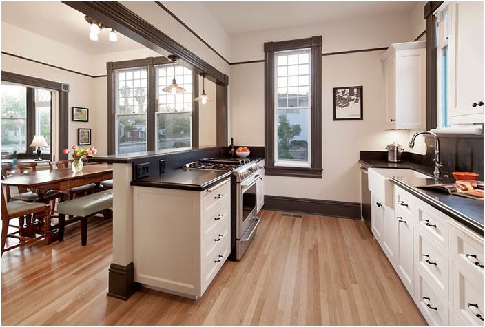
During the renovation, the architect applied an open plan, connecting the living room, dining room and kitchen.
Open plan ground floor
Previously, the kitchen was separated from all the rooms by a wall, which made the house visually appear even smaller from the inside, it was inconvenient to entertain guests in such a cramped room.
Open house layout
Now the living room, dining room and kitchen look great together. In addition, Brian can cook and at the same time interact with children or friends who are sitting at the table or bar..
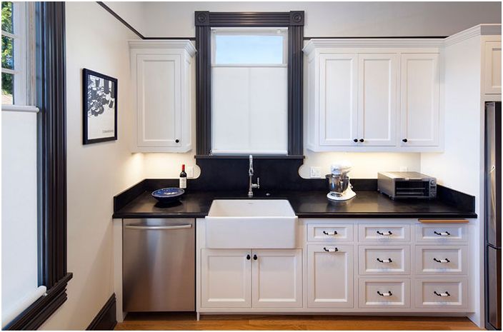
Kitchen
The old tiles on the walls have been abandoned in favor of granite surfaces, which are more effective and functional for the kitchen, while the sink and kitchen cabinets are perfectly in keeping with the old style. Granite surfaces are easier to maintain than tiles. Brian says he is delighted with all the new equipment, including a dishwasher that is quiet and efficient, a four-burner stove and a refrigerator..
Built-in cupboards in the kitchen separated the dining room from the kitchen, thereby hindering the communication process.
Kitchen
The lockers have been modernized and relocated to free up the wall. Now there is a bar counter on the side of the dining room, and on the side of the kitchen there is a stove and part of the working area.
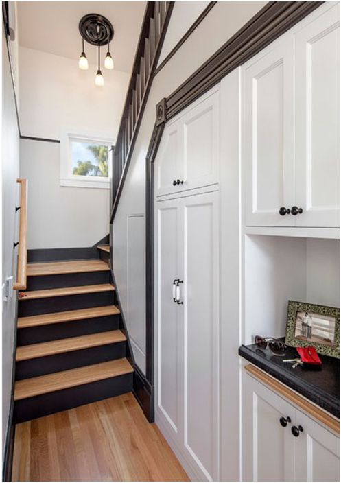
Staircase to the second floor
The new layout made it possible to move the pantry out of the kitchen by placing it under the stairs. The staircase is adjacent to the wall, which is shared with the new garage. Everything looks as if it has always been.
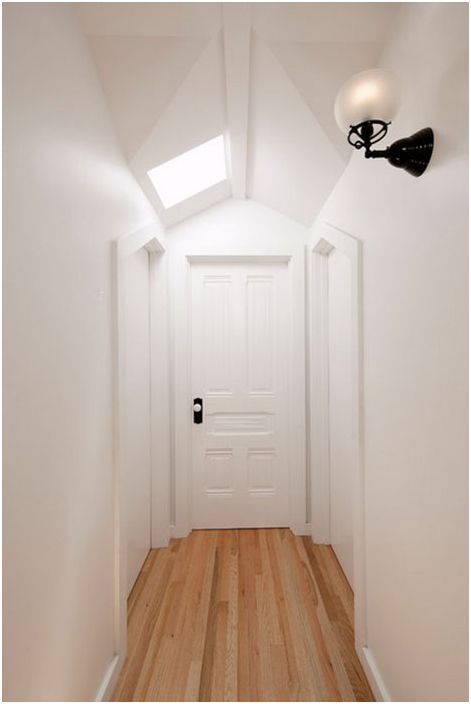
White color in the interior
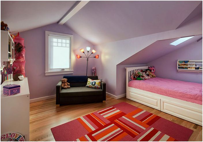
The white walls and ceiling and the skylight make the loft a very bright space, suitable for the two bedrooms where the sisters now live..
Children bedroom
When arranging the bedrooms in the attic, we tried not to overload the space with things. Niches in the ceiling add charm and make the room interesting from the architectural point of view.
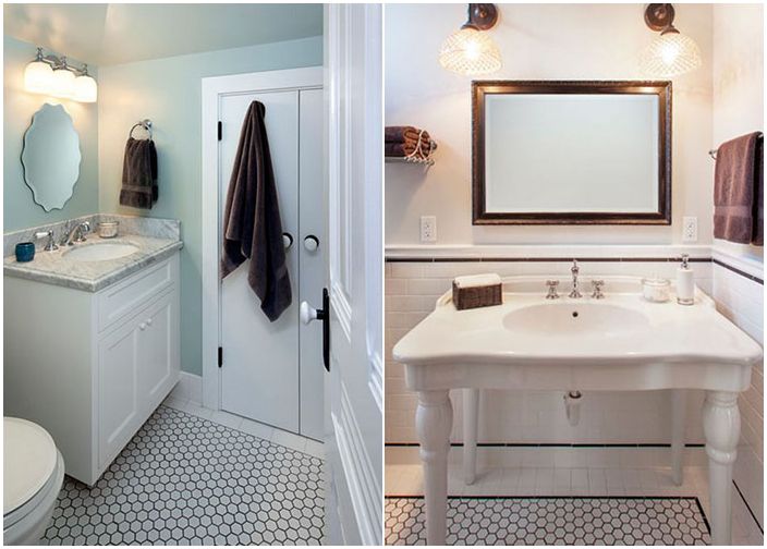
Modern materials have been used for the children’s bedrooms, including hexagonal tiles, chrome plumbing fixtures and enamel taps. The interior designer adhered to the Victorian style in decor, in detail. Since the family’s budget did not allow for too much, so the stake was made on simplicity, tradition and functionality..
Bathroom
The parents’ bathroom, which is located on the ground floor, also has antique elements. A vintage vanity unit in white with an integrated washbasin that goes well with the tiles. The wood finish in this bathroom is repeated throughout the home..
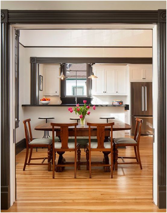
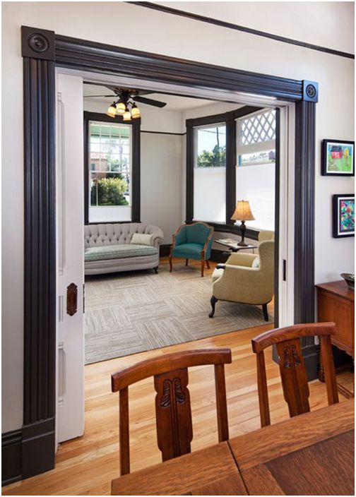
Dark finish of the doorway
The wood trim of the entrance and window openings is specially made in black, for originality and as an effect of surprise. There is so much light in the rooms that black does not look gloomy or dull.
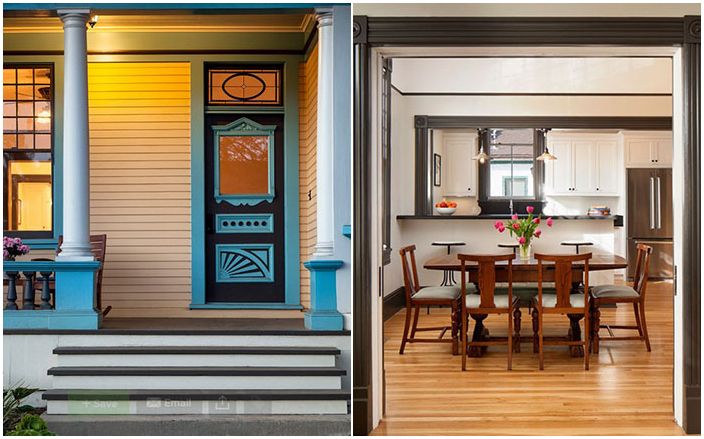
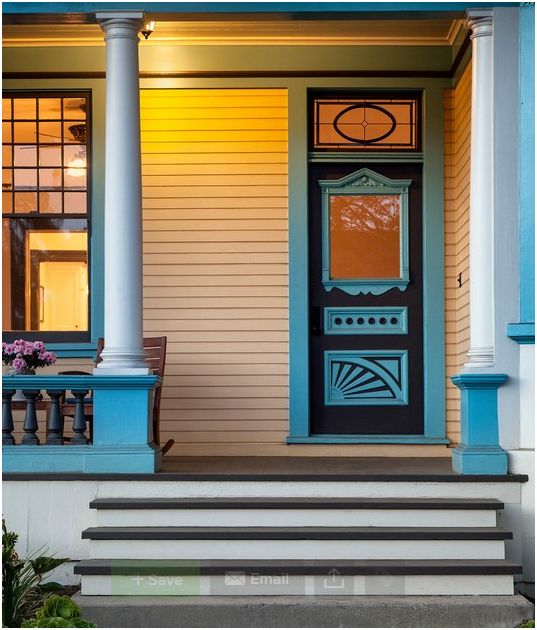
Entrance door
The designer studied all the color combinations that match the historic façade. A jacaranda tree grows near the house with incredibly beautiful lilac flowers that bloom in spring and summer. This fact influenced the choice of colors for the exterior of the house, as it had to be dynamic..

