Meeting the past and the present: how to combine an old house with a modern pavilion
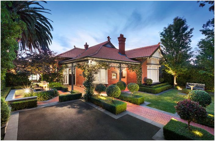
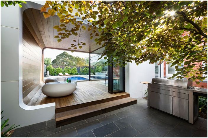
The curved timber extension is the hallmark of this beautiful early 20th century home in the suburbs of Melbourne. She successfully blurs the lines between the interior and the courtyard thanks to glass doors, walls and wood cladding. The owners of the house wanted to expand the premises in this way in order to equip a place for meeting with guests and friends..
This assignment was handled by architect Linda Simons of LSA Architects, who designed and presented the complete project to the home owners. One of the owners is a professional chef, so a professional and multifunctional kitchen was a prerequisite. Simons succeeded in satisfying customer desires by adding a generous pantry with many cupboards, a double sink, and space for top-notch kitchen equipment. The kitchen can remain open and share a common space with the living room, or closed with sliding double doors.
The link between the old house and the new pavilion
The house has three bedrooms, a parent’s bathroom adjoining their bedroom, and a bathroom for children and guests, a living room and an office. They can be accessed from the central corridor, which also leads to the backyard and the new luxury annex. The owners of the house are very pleased with the result, because they managed to combine the beauty of the old house and the functionality of modern housing..
Short reference:
The house is occupied by: a married couple with two children
Location: East Malvern, Melbourne
Sizes: 3 bedrooms and 2 bathrooms
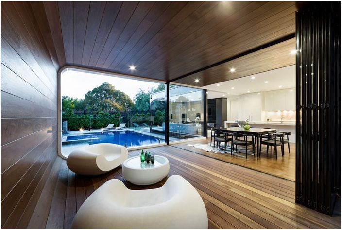
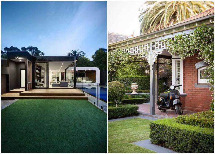
Architect Linda Simons’ primary focus was the modern extension in the backyard of the house. During the preparation of the project, she constantly wondered how not to spoil the beauty of the old house located in the historic district in East Malvern, known as the Gascony Manor. From the main entrance, the house has not lost its original appearance and original forms, but entering from the backyard, guests find themselves in another world, absolutely modern and unique. The living room and dining room, which are now in a curved annex, are finished with Tasmanian oak wood paneling. It is here that the old meets in the form of an old house of the early 20th century and the new in the form of an ultramodern extension..
New pavilion
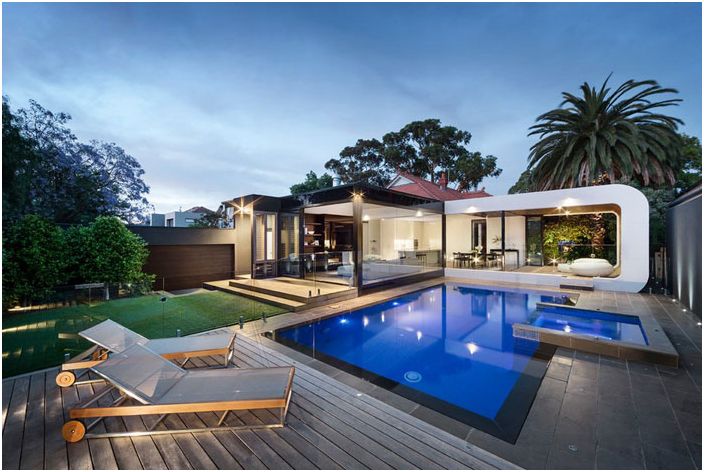
The living room is separated from the pool by glass sliding doors that protect people in the living room and in the pavilion from splashing water. The design and location of the extension make it possible to receive guests and have fun all year round, as it is protected from bad weather, but available to fresh air and light. The family uses the pavilion as a veranda and dining room.
Kitchen and dining room
The rounded white furniture was purchased by the owners of the house during their trip to Milan for the fair. The coffee table is illuminated from the inside in the evening, which is ideal for summer evenings.
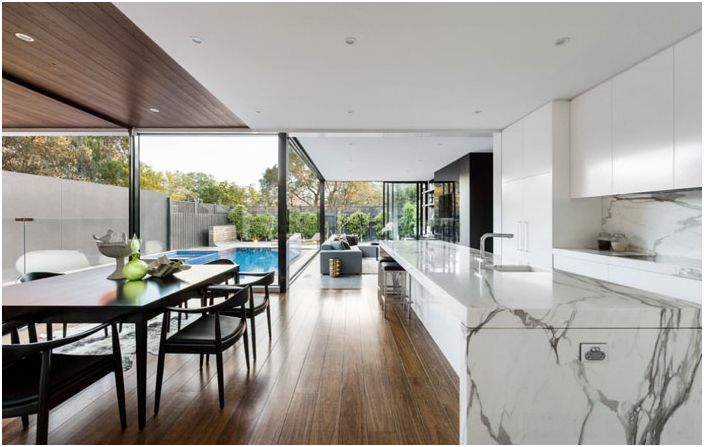
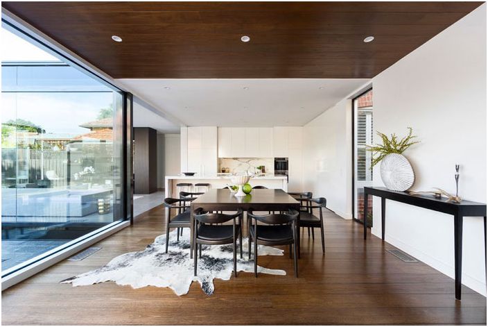
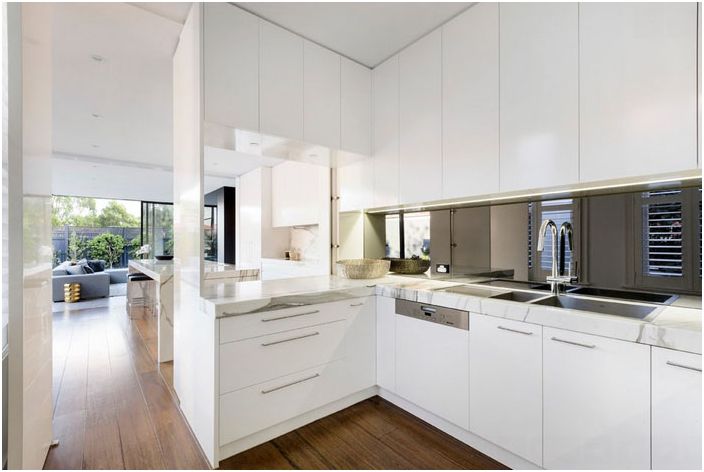
Right behind the dining table is the white kitchen, the heart of the extension, so Simons gave it special attention. The kitchen is of great importance for the family, especially for its head, as he is a professional chef who skillfully handles all modern devices and gadgets and appreciates natural materials, including marble, from which the surfaces and protective apron are made. The kitchen is at the intersection of the living room, dining area and outdoor area, including the garden and pool, as if it is a link.
Canteen
The dining area is located between the living room and the kitchen, these three areas flank the pool. The entire annex is very well lit thanks to large windows and light-colored walls.
Kitchen and pantry
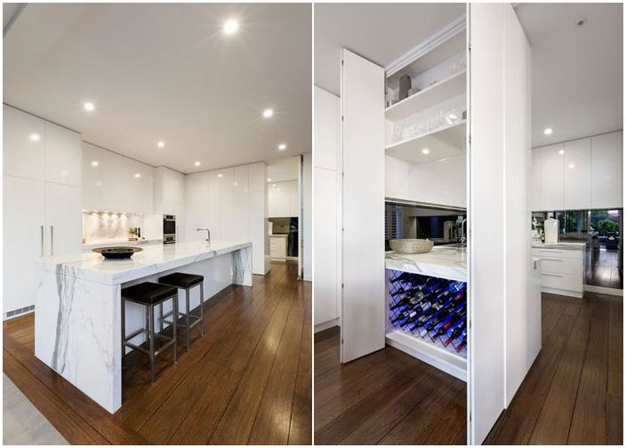
In the light of the lamps, marble worktops and glossy cabinet doors give a beautiful glow. Thanks to the clever design, almost all the equipment in the kitchen is hidden, but always ready to go. You can note the built-in refrigerator, many cabinets and drawers for pots and pans, as well as a spacious pantry, which is separated from the kitchen by double doors.
Pantry
When the doors are open, the entire pantry can be seen from the kitchen. But due to the fact that it is separated from the kitchen, the room is kept in perfect order. The pantry has a spacious wine storage compartment. There is also an additional work surface where you can prepare food too. This is where parents prepare breakfasts and snacks for their children for a quick snack.
If the kitchen has a single sink, Simons has installed a double sink and dishwasher in the pantry in case of mass parties. She decided in the pantry not to deviate from a single kitchen design concept and also installed marble countertops..
Living room with pool behind glass
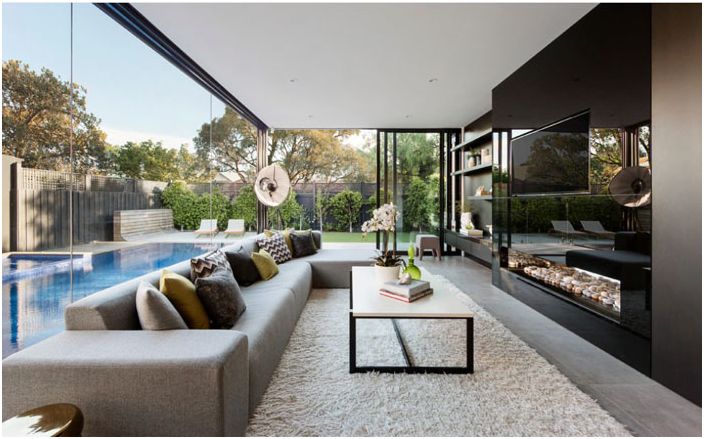
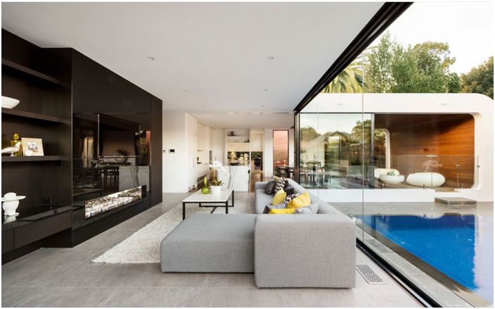
There is a spacious living room next to the kitchen and swimming pool. For her decor, Simons chose muted but warm monochromatic tones. The gray sofa came from Italy – it is low but long, a great place for family and guests if they decide to watch TV.
The TV and fireplace are mounted in wall cabinets with dark glass doors, which not only reflects the view from the window, visually expanding the space, but also seems to dissolve in it. A little further against the wall is a dark wood shelving, in addition, there are also boxes where audio and video equipment is stored.
Living room in the annex
The entire extension is L-shaped, with the living room and kitchen on one side and the curved pavilion on the other. This was done deliberately so that there was a lot of light in the living room and kitchen, as this part of the extension faces south. In addition, the surface of the pool, reflected in the large windows, is also a source of light for the living room..
Old and new
The extension is clearly visible from the garden. You can perfectly distinguish its main elements: a white curved pavilion lined with wood, a square-shaped metal frame of the living room and a gray terrace. It is from this angle that you can also see the covered exit from the house to the courtyard..
Swimming pool with terrace
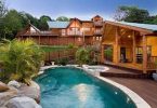
From all the premises of the annex, the pool with azure water is clearly visible. There are terraces around the pool where family and guests can relax and have fun.
House plan
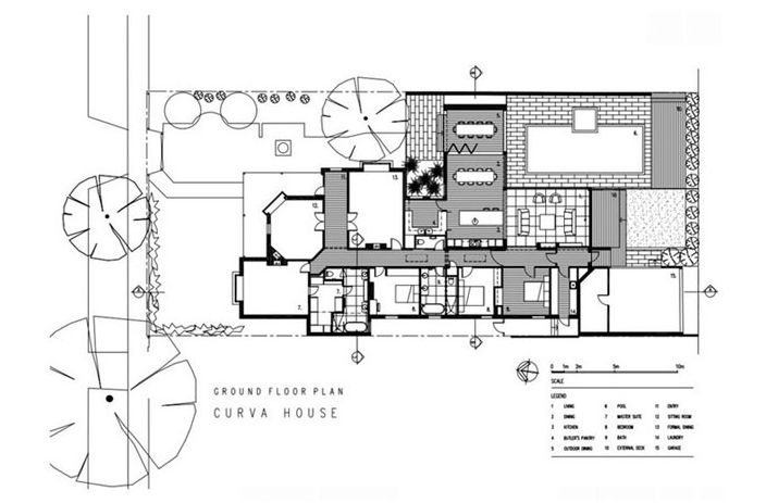
The Simons drawing clearly shows the old and new parts of the house. All rooms in the house can be accessed from the central corridor, except for the pavilion, which is located next to the dining room. It can be considered a transition point from old to new.
Patio
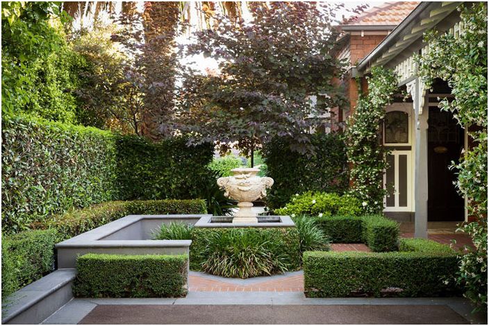
When the owners of the house bought the house, they first of all took up the garden and planted some trees and bushes. Today it looks great thanks to its landscaping. The backyard garden contrasts with the low bushes at the back of the yard..
Stained glass
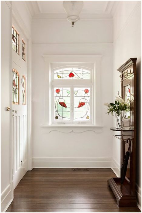
At the central entrance, the door and window are decorated with original stained-glass windows. In addition, after the expansion, the floor in the house, namely in the hallway, was changed to the same as in the new extension..
The house has three bedrooms and a study, which can be considered the fourth bedroom.
Parent bedroom
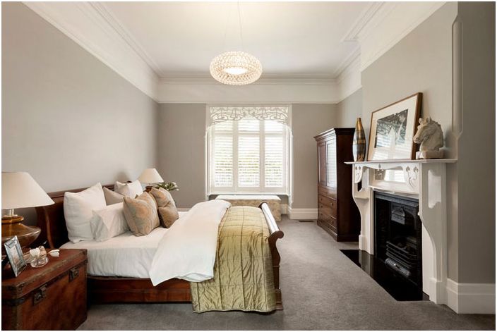
The master bedroom has a large mahogany bed. What was once a small bedroom and is adjacent to the parents’ bedroom is now a dressing room and bathroom.
Bathtub with fireplace for parents
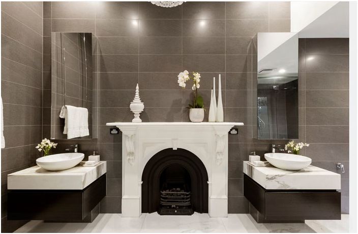
The owners of the house wanted to keep the original fireplace, which they now have in their bathroom. Simons decided to paint it white to make it stand out in the interior, and brought gas to it to keep the bathroom warm at any time of the year. The top of the dressing tables is made of the same marble as the countertop in the kitchen, and they are located on either side of the fireplace.
Bathroom for children and guests
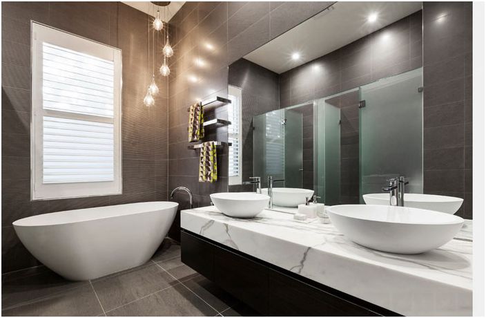
The bathroom for children and guests is slightly larger. The shower area and toilet are located behind frost-effect glass for privacy. The freestanding bathtub is located next to the dressing table, which has two washbasins for children.
However, what can we say about the unification of the past and the present in a beautiful residential building, if architects and designers manage to work wonders and turn absolutely unsuitable premises into stunning modern housing. e.g. churches and watchtowers.

