The strangeness and delights of modern architecture: 18 puzzle houses
Modern architectural engineering is characterized by strange shapes, impressive dimensions and original solutions. Geometric design ideas are becoming popular, and the cantilever designs of modern homes are intriguing.
Vitra Haus building

Vitra haus
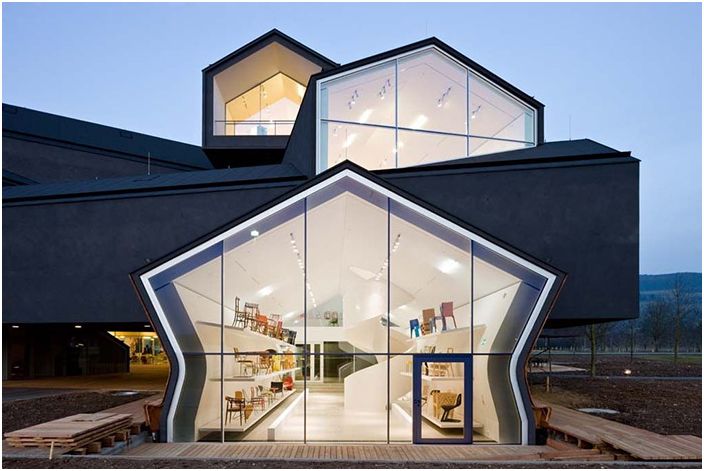
Among the cantilevered houses that have appeared recently, it is necessary to note the houses from the town of Vitra Campus, as incredible new buildings. Vitra Haus, one of many built here by Herzog & deMeuron, features an unusual sectional design in the form of superimposed structures with sloping roofs.
Vitra haus
The project is based on two principles that architects have been using lately, they are multilevel and the principle of a children’s pyramid. Each level of the house is a separate small house, like a showroom.
LP House building
LP House
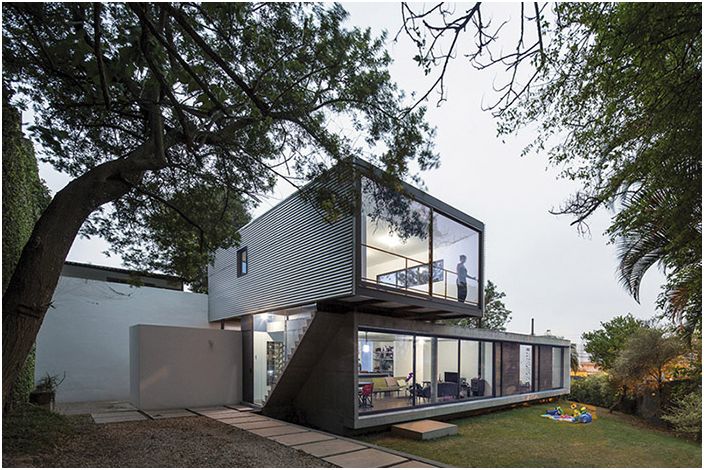
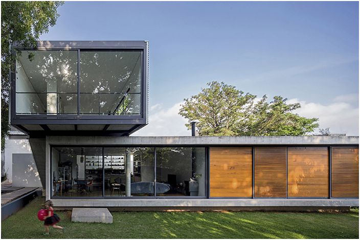
Located in Sao Paulo, Brazil, LP House is a private home designed by Metro Arquitetos Associados. It consists of two main sections: lower and upper, which are stacked on top of each other and form one whole. The whole house is made of reinforced concrete, glass and wood.
LP House
The upper level is a smaller and lighter section made of steel panels and metal structures. Both sections of the house are connected by a staircase that leads outside the interior. A clear demarcation between the two levels allows you to organize the interior.
That House in Melbourne
That House in Melbourne
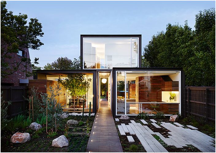
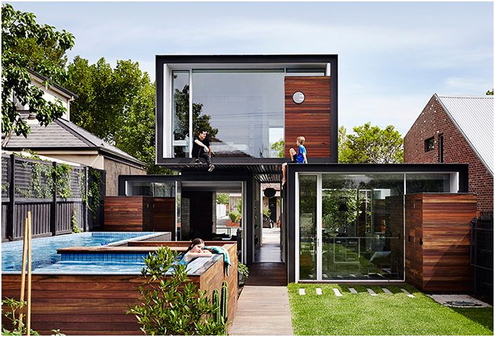
That House is a residential building located in Melbourne, Australia. It was designed by Austin Maynard Architects, who presented it as three distinct sections of boxes. The two main sections of the house stand separately, there is even a passage between them, and the third section is asymmetrically located on them.
That House in Melbourne
All sections of the house in front and behind are equipped with large window-walls, and in the side parts of the window are completely absent. In one of the lower sections there is an open terrace from which a real tree grows. This seemingly insignificant detail is the link between the interior and exterior of the house. At the back of a is the swimming pool, lined with horizontal wood panels that mimic the finish of all three sections of the house..
Shakin Stevens House
Shakin stevens house
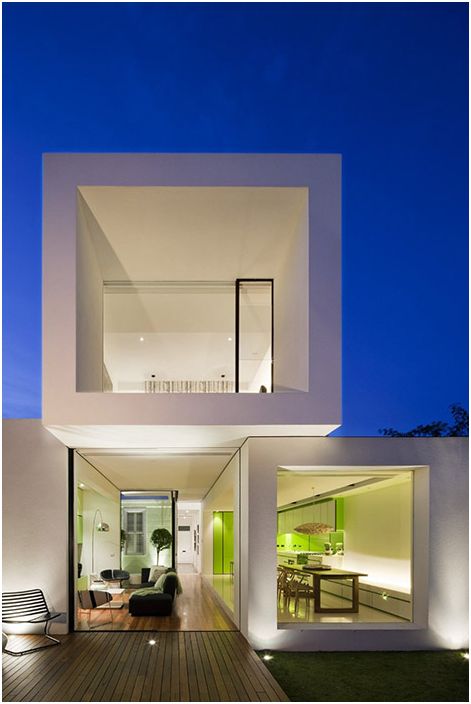
The home, located in Melbourne, Australia, was designed by Matt Gibson Architecture + Design. The most basic requirement of the client was the connection of the building with the green area around the house. To implement this idea, the architects created an open-space house..
Shakin stevens house
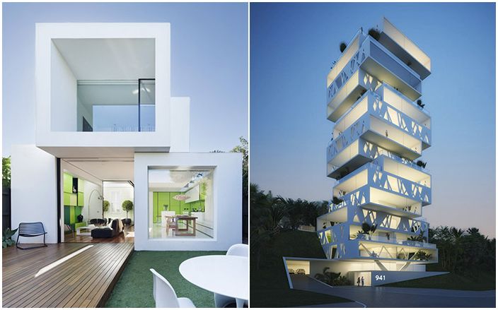
The building itself consists of three isolated externally asymmetrically installed white sections. The three of them create a single whole, but they perform different functions. All sections offer panoramic views of the surroundings, allowing direct contact with nature.
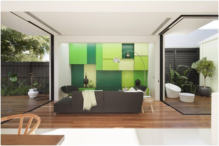
The interior is based on white, which is complemented by bright shades of green and brown in the form of wooden interior elements, including furniture and flooring, both inside and outside the house, that is, verandas.
Building in Mexico City
Building in Mexico City
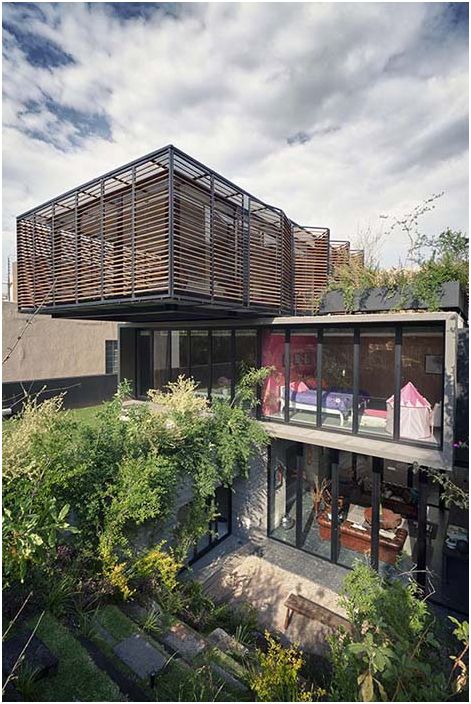
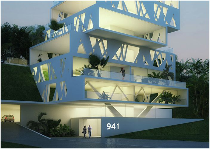
Architect Yuri Zagorin Alazkari from ZD + A has designed an intriguing residential building in Mexico City. It consists of three floors, represented by separate sections, set according to the principle of a children’s pyramid. The house was built in 2011. During the construction, many difficulties had to be overcome. One of which is the shape and size of the land, which was uneven and narrow.
Since the house is sandwiched by two neighboring buildings, ensuring sufficient daylight was also a challenge. To this end, the architects went for some professional tricks, such as the reflective floor and glass walls. Since the house had to be built vertically upwards and on the basis of separate sections, this simplified the task of creating a functional and private space.
Cantilever house in Sevres
Cantilever house in Sevres
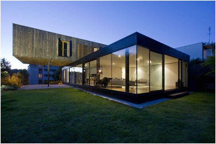
The modern split-level cantilever building located in Sèvres, France was designed by Colboc Franzen & Associes. Its area is 879 sq. m. Three separate sections of the house divide the house into three zones with different functionality.
One of the sections contains an entrance hall, study, laundry room, basement and garage. The second section, which is reserved for social needs, contains the living room, dining room and kitchen, in the third, the bedrooms.
Casa Golf building
Casa Golf building
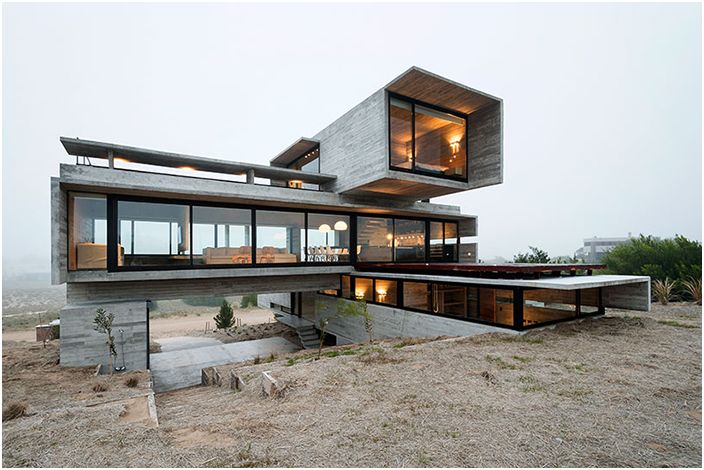
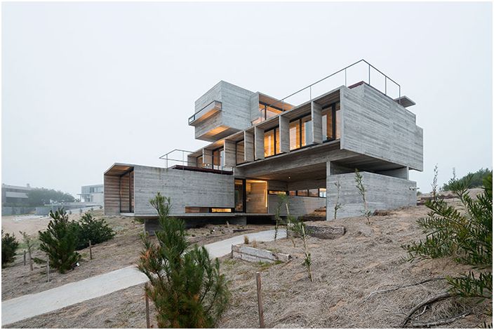
Modern architecture allows constructing unique and incredible buildings. Architect Luciano Crook designed Casa Golf located in the center of Costa Esmeralda, Buenos Aires, Argentina. The name of the house is due to the fact that the area was originally set aside for the construction of a golf course.
Casa Golf building
The house rises above the surroundings, which provides a panoramic view from its windows. To make the most of the opportunities provided by nature and to ensure the privacy of the privacy of the home owners, the architect created the house, guided by the principles of geometry and sculpture..
The house consists of separate sections. One has the bedrooms and an internal staircase that connects them to the kitchen, living room and dining room in the second section. The bedroom of the owners of the house, with the wishes of privacy and a minimum of openness, is in the third section.
Crossbox House building
Crossbox House building
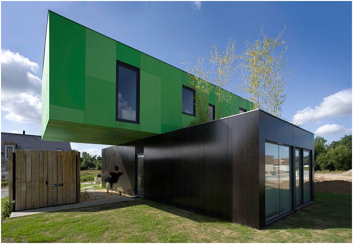
Crossbox House is an eco-friendly home located in Pont-Pins, France. It was designed by Clement Gillet Architectes from prefabricated blocks. The total area of the land on which the building is located is 340 sq.m..
The building is mainly constructed from parts of old cargo port containers. The house consists of two main sections, stacked on top of each other. The upper one is colored green and the lower one is dark brown. The prototype of this house was a three-level industrial style building. The construction of the house took four port containers, so the budget was modest, and the technologies and materials used were environmentally friendly.
Orchid House Building
Orchid House Building
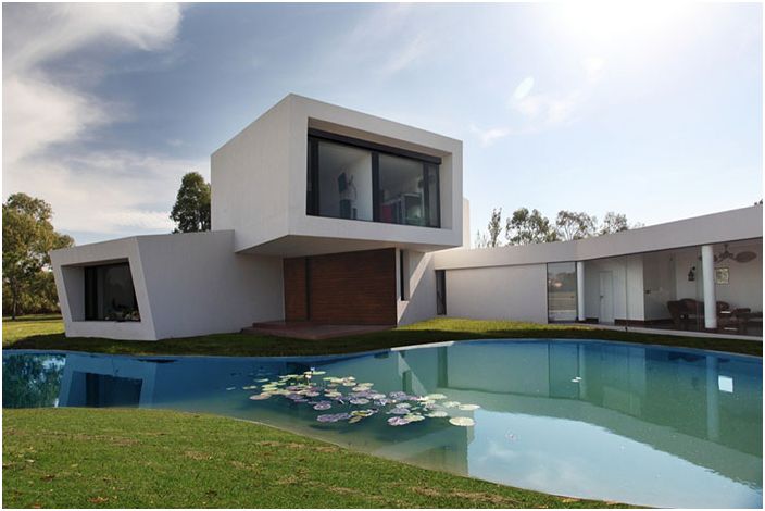
The Orchid House project is the result of the dedicated work of the architects Andres Remy Arquitectos. The house was built in Buenos Aires in 2008 on an area of 3640 sq. m. Clients, and this is a young couple with two small children, asked that this was a family home, cozy and energy-saving.
The clients also had an interesting hobby – growing orchids. This prompted the architects to come up with a name like Orchid House. And the architects also took their inspiration from orchids, more precisely, their roots, stems and flowers. These three components are reflected in the design of a modern and elegant home..
LK House building
LK House building
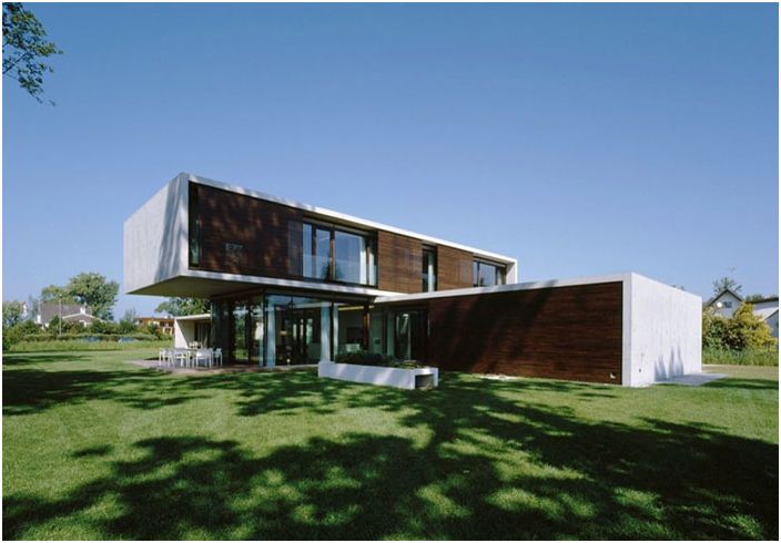
The design of the building is quite simple, as it consists of two rectangular blocks stacked on top of each other. The house was designed by Dietrich Untertrifaller Architects in Gard, Austria. Both parallelepipeds are made of concrete, and their massiveness is slightly leveled by lighting solutions and an open green area around the house. Thanks to the large windows, these blocks provide plenty of natural light and panoramic views of the surroundings..
The simplicity of the interior made it possible to focus on the freshness of the color scheme used. The designer used only two primary colors. Walls, both inside and outside the building, ceilings are painted white, and a dark color, in particular oak, was used in finishing floors, window frames and doors. Simplicity is the main idea of the project.
Crossed House building
Crossed House building
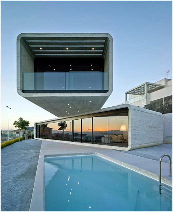
Located in Murcia, Spain, the Crossed House is 232 sq.m. The windows offer stunning views of the mountains and the valley. The house was built according to the project of the Clavel Arquitectos company, whose architects saw it, consisting of two sections, asymmetrically installed at an angle to each other..
Each section is 20 meters long and 5 meters wide and is installed at a 35 degree angle, which provides the perfect view of the surroundings and ample daylight and sunshine all day long. Thanks to this shape and this arrangement of the sections, the architects managed to create a cozy house in all plans and even install a pool in the yard. All section corners are rounded, making the building appear delicate and elegant.
Small Section House in Wisconsin
Small Section House in Wisconsin
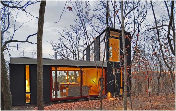
Occupying an area of 270 sq. m. the building was built for a young family in a remote corner of the forest in Wisconsin. Its compact design blends in perfectly with the surroundings and landscape.
To implement the idea, it was decided to build vertically upwards, placing one section of the house on top of another. In the hallway, visitors are greeted by a staircase that connects it to the kitchen and bedrooms. This section also houses the living room, workshop, bathroom and storage room. The social area has floor-to-ceiling curtains that separate it from the kitchen and bedrooms.
House in Birkenhead
House in Birkenhead
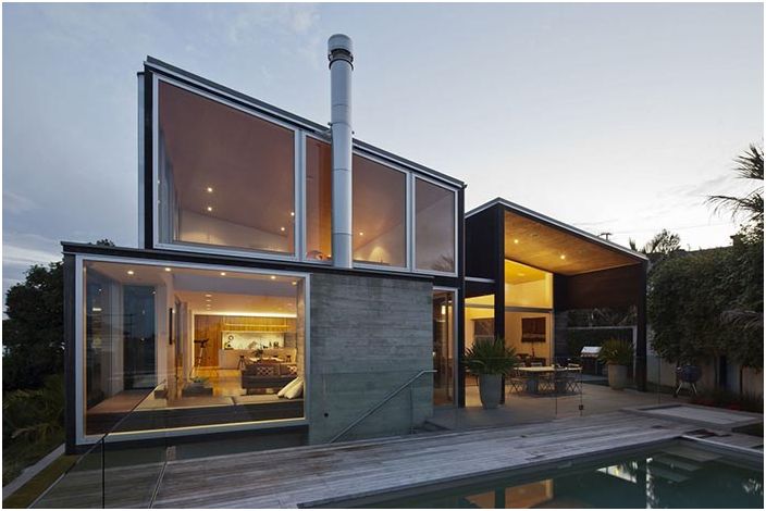
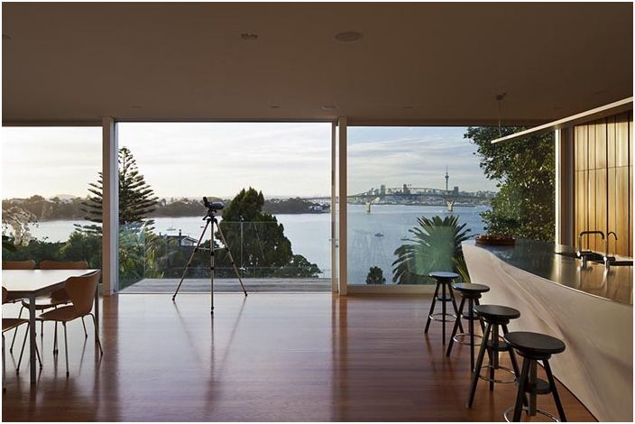
This house was built as a country house for a family where they could relax while enjoying the comfort, sunny days and beautiful views. It was designed by Crosson Clarke Carnachan Architects, Auckland, New Zealand. The house is located on a land plot of 400 sq.m. and is located at an angle.
House in Birkenhead
The main task of the architects was to make the house compact, but cozy and functional. As a result, they built three separate sections. Downstairs there are four bedrooms, a storage room and a bathroom. One of the upper sections houses the kitchen, dining room and living room, while the uppermost section houses the owner’s bedroom, dressing room and study..
HECTAAR office building
HECTAAR office building
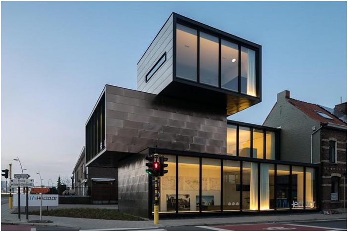
The HECTAAR office building was designed by CAAN Architecten for HECTAAR in Roeselare, Belgium. It is built on a small plot of land at the corner of two city streets, where an old gas station used to be. Near the house there are other urban buildings surrounded by front gardens. The main task of the architects was to construct such a building so that it would fit perfectly into the quarter and be sufficiently modern and cozy.
The building consists of several blocks, each oriented in the right direction. The lower section contains the entrance, meeting area, technical rooms and bathrooms. The upper block, which protrudes two meters above the lower one, is oriented towards the main street and the parking lot. The second section houses the offices and the third section contains the boardroom. The third section was built more for aesthetic purposes to make the building look better on the outside.
Art gallery in Vancouver
Art gallery in Vancouver
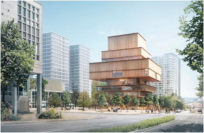
The Art Gallery building in Vancouver, Canada, was designed by Herzog & de Meuron. It is a cantilever building made of wood and consisting of several sections. It covers an area of 28 800 sq. M. in the city center and includes 7,900 sq. m. In addition, it has a theater with 350 seats, a library and an educational center.
The lower section is completely transparent thanks to glass walls that provide visual contact with the street. On the ground floor of the building there is an exhibition pavilion, a cafe and ticket offices. There are two parking zones underground.
The Cube Building
The Cube Building
The Cube is a luxury apartment building designed by Orange Architects in partnership with architects and builders from JSA, CIMKA and Hofman Dujardin. This is a 50-meter building, consisting of 19 apartments, each area from 90 to 180 sq.m .. The architectural solution of the building is absolutely unique.
In order to use the allocated land plot as efficiently as possible, to provide a beautiful view of the surroundings of all residents of the house, the architects decided to create a multi-section building, placing the blocks one on top of the other at different angles. The house has an elevator and a staircase connecting all floors of the house.
Skyscraper CDB & Minsheng
Skyscraper CDB & Minsheng
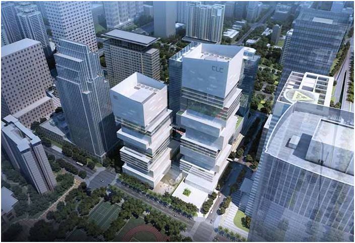
The skyscrapers were designed and built for the International Conceptual Design Competition. One of them was built by Saraiva + Associados. The main goal of the architects was to create a real city landmark, with impressive architectural, spatial solutions and meeting all environmental requirements.
The design of the buildings reflects the history of the city, its geographical and ecological features. Thanks to the organization of a green recreation area in the upper part of the building, it has acquired additional advantages and uniqueness. The architects managed to visually move away from the traditional appearance of an office building and create a unique and interesting complex.
Biotechnology Park in Mexico City
Biotechnology Park in Mexico City
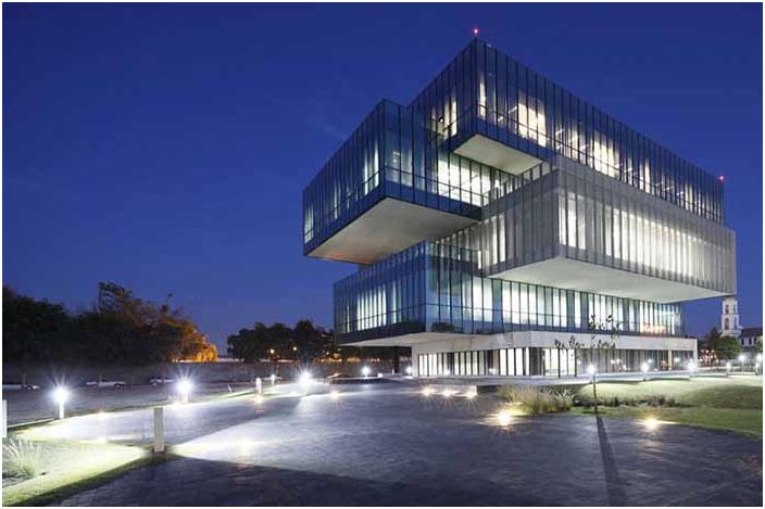
Architect Tatiana Bilbao was involved in the design of a building for a biotechnology park located in Mexico City, on the territory of a local university. It houses office, commercial and classrooms where students are engaged in research work.
The building consists of five separate and oriented sections in different directions. This approach provided all rooms with sufficient daylight and sunlight..

